







How to Create a Positive Atmosphere with Art: Joy, Hope, Freedom and Playfulness
Choose art for a positive atmosphere by defining what the space and its users need, then comparing meaning, subject, style, visual energy and placement—not relying on a mood label alone.
Published:
 How to Create a Positive Atmosphere with Art: Joy, Hope, Freedom and Playfulness
“Positive” is a useful ambition, but a slippery shopping instruction. One person imagines a burst of color; another wants an open landscape, a humorous figure or an image of release. A more useful starting point is What kind of positive presence belongs here, for these people, doing this activity?
Look at the whole visual argument: subject, gesture, color relationships, open or compressed space, rhythm, density and the meanings you bring to the image. Bright color may feel buoyant, but hope can also arrive through a distant horizon and freedom through a difficult image of release. Responses differ, so treat a mood category as a place to begin looking, not as a promise.
Either can work. Harmony might come from repeating one hue, curve or material; contrast might give the room a needed focal point. The useful question is what should connect and what should stand apart. Also compare visual density: a busy painting beside a patterned rug and crowded shelf creates a different atmosphere from the same painting on a quiet wall.
Use the same basic process, then change whose needs lead it. A family space needs shared ownership; a workplace needs attention to users, activity and identity; a reception or hospitality space needs to consider first impressions, diverse guests and how long people will actually look. The section “Use the same process, change the setting test” develops these differences.
Replace the broad word positive with something you can test. Do you want the room to feel sociable, hopeful, energetic, freeing, playful, reassuring or quietly optimistic? These qualities overlap, but they do not look identical. A playful family room can tolerate a visual joke that would distract in a focused work area. A hotel lobby may benefit from an image that starts a conversation; a fast-moving reception desk may need a work that reads clearly from farther away.
Write a one-sentence brief before opening a catalog. For example: “We want a warm, energetic focal point that three generations can enjoy from the dining table,” or “We want a thoughtful welcome that reflects curiosity without turning the reception area into a visual obstacle course.” The sentence gives you something stronger than a color preference: it identifies the users, the activity and the job the painting should do.
Then name the boundaries. Who shares the space? Are there subjects someone finds uncomfortable? Is the wall seen across a room or beside a chair? Does the painting have to compete with screens, signage, shelving or a patterned textile? These questions are not joyless preliminaries. They are how an attractive image becomes a good daily companion.
Individual taste is part of the evidence. In a small study using 109 varied artworks, Edward Vessel, G. Gabrielle Starr and Nava Rubin found striking differences in which images participants rated as deeply moving—an artwork highly rated by one observer could receive a low rating from another. The study involved 16 people viewing images on screens, so its result cannot predict a response in a particular room. Its practical implication is clear: ask the actual users how they read the work. Read the original study on individual aesthetic responses.
A positive atmosphere can begin in at least four different places: formal energy, symbolic meaning, recognizable subject or playful narrative. Each work below gives the eye a different task and offers a more precise choice than “bright versus calm.”
In Splashes, hot pink, turquoise, blue, orange and small flashes of yellow scatter across a white ground. Some marks land as rounded drops; others trail into thin, quick lines. The surface is busy, but it is not sealed shut. White intervals remain between the marks, letting the color feel airborne rather than heavy.
That balance makes this energetic abstract acrylic with colored drips and open white space a useful example of joy expressed without a figure or a story. Its activity comes from variation: large beside small, warm beside cool, dense clusters beside open canvas. It may provide lift in a restrained room. In a space already filled with competing patterns, the same density may feel more insistent. That is a placement question, not a verdict on the painting.
WeArt lists the work by Sandra Gross as 100 × 80 cm and unframed. It also appears among WeArt’s joyful Modernist paintings. That shop page helps with discovery; the visible rhythm is the reason to consider this particular work.

Splashes by Sandra Gross. Original acrylic on canvas, listed as 100 × 80 cm; unframed. Original catalog image.
Set it Free is more restrained in color and more direct in symbolism. A grey reclining figure stretches across a pale ground. A black cage-like structure encloses the torso; colored butterflies rise into the open space above, while one remains within the bars and another reaches the extended hand.
This symbolic acrylic painting of a caged figure and rising butterflies can be read as release because enclosure and flight are held in the same composition. Its positive quality lies in movement from confinement toward possibility. The reclining nude and cage imagery may feel liberating, vulnerable, unsettling or intimate depending on the viewers and the setting. Ask the people who will meet it whether that meaning suits the space.
WeArt lists the original work by Hadar Raanan as 150 × 100 cm and unframed. It appears among WeArt’s paintings about freedom in an anti-realist style. Use that broader shop page to compare different approaches to freedom and anti-realism; the label is a browsing aid, not a promise that every work will feel liberating.

Set it Free by Hadar Raanan. Original acrylic on canvas, listed as 150 × 100 cm; unframed. Original catalog image.
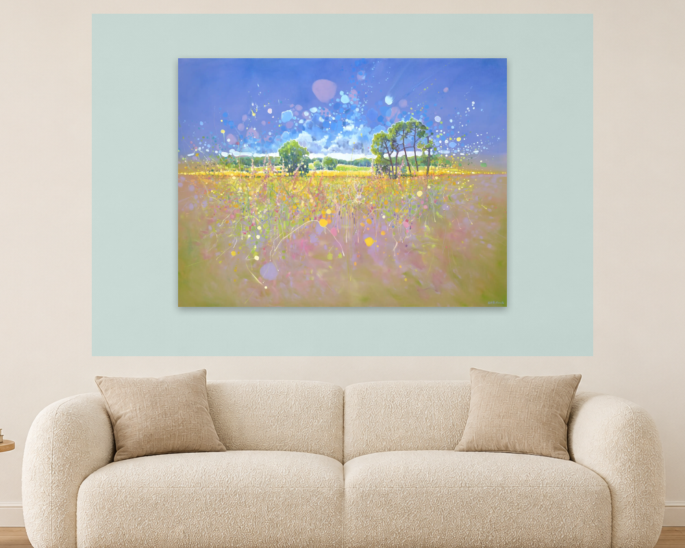
In Transcendent Springtime, the horizon sits low, giving most of the canvas to a broad blue sky. A yellow-pink field spreads beneath it. Trees provide a recognizable middle distance, but dots, drips and pale bursts loosen the scene into something less literal. A small hare waits near the lower center, easy to miss at first and rewarding a closer look.
The painting can suggest hope through openness and emergence rather than through a single emblem. The distant view reads quickly as light, sky and field; the near view becomes more intricate. This hopeful semi-abstract oil landscape with open sky and luminous spring color therefore offers two tempos of attention—useful when a work will be seen both in passing and at rest.
WeArt lists the painting by Gill Bustamante as 121.92 × 91.44 cm and unframed. It appears among WeArt’s hopeful contemporary paintings. A nature subject does not automatically make a work quiet; here, the dispersed marks and high-key color keep the field visibly active.

Transcendent Springtime by Gill Bustamante. Original oil on canvas, listed as 121.92 × 91.44 cm; unframed. Original catalog image.
A group of stylized dancing figures leans, lifts and moves across the red foreground of Summer Party. Their angular limbs point in different directions; orange hair streams outward like banners. Rolling green hills steady the scene, while a yellow band at the horizon lifts the otherwise muted sky.
The work's playfulness comes from bodies that seem almost too elastic for gravity. It is a useful counterpoint to Splashes: both can feel lively, but one uses paint rhythm and the other uses gesture and narrative. WeArt lists this playful figurative watercolor with dancing figures by Roman Zuzuk as 51 × 35 cm and unframed.
Its smaller paper format changes the placement question. Rather than asking it to command a distant lobby wall on its own, consider a conversational viewing position or a carefully spaced group. Because the listed dimensions describe the unframed sheet, include the finished mat and frame when you mark its footprint on the wall.

Summer Party by Roman Zuzuk. Original watercolor on paper, listed as 51 × 35 cm; unframed. Original catalog image.
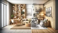
Once a painting has earned its place through meaning and sustained interest, look at what happens around it. Harmony, contrast and visual density are practical design controls, not formulas. The comparison below keeps the room, furniture, lighting and painting fixed, changing only the color of the painted wall panel.
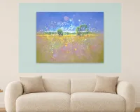
Harmony does not require an exact match. One turquoise accent from Splashes might reappear in a cushion while its pinks remain independent. In the harmony example, the pale blue-green panel picks up the sky and tree notes in Transcendent Springtime, allowing the landscape to open gently into the room. Repetition creates continuity; too much can reduce a painting to an accessory chosen after the sofa.
Contrast needs a purpose. In the contrast example, the muted terracotta panel gives the same landscape a warmer, firmer boundary, making its blue sky more emphatic. Contrast can also be stylistic: Summer Party's loose, humorous figures might soften a room dominated by straight lines and formal furniture. Decide which difference should carry the emphasis instead of making every surrounding object compete.
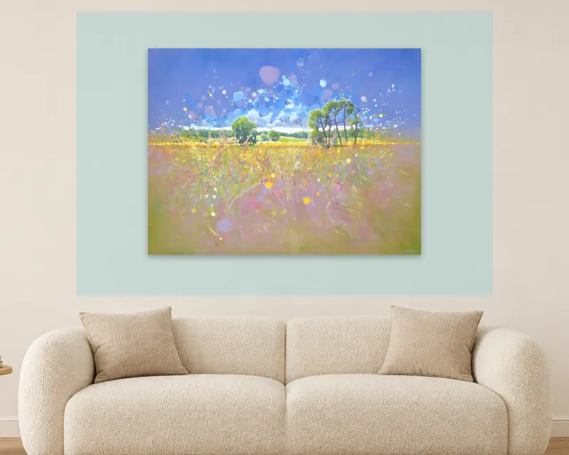
Harmony option — Transcendent Springtime by Gill Bustamante, shown unframed above a cream sofa with a pale blue-green painted wall panel. Artwork © Gill Bustamante / WeArt catalog. Room visualization for illustration. Concept only — scale not verified.
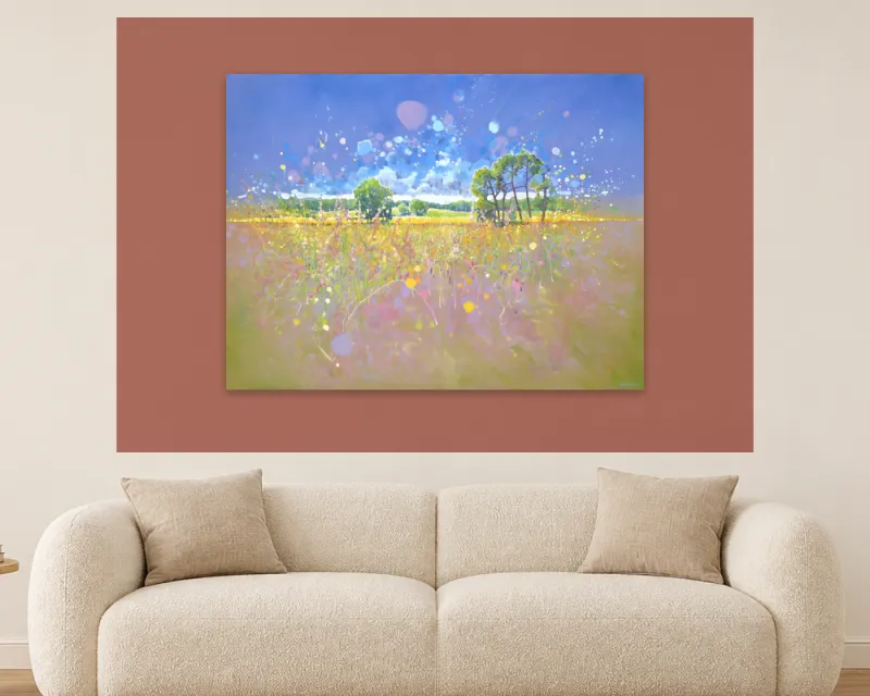
Contrast option — Transcendent Springtime by Gill Bustamante, shown unframed above the same cream sofa with a muted terracotta painted wall panel. Artwork © Gill Bustamante / WeArt catalog. Room visualization for illustration. Concept only — scale not verified.
Compare density as well as color. Splashes is crowded with small chromatic events; Set it Free concentrates attention around a few large forms. A dense painting beside a patterned rug, open shelving and digital signage creates cumulative activity. A quiet wall gives a complex work more room to breathe.
For a fuller palette exercise, see WeArt's Guide to choosing art colors for a living room. The Guide to using vibrant art in a modern interior develops color, rhythm and visual weight. If your idea of positive is lower in intensity, compare spacing, edges and contrast in calming abstract art.
A product photograph tells you what the image looks like; it does not tell you how large it will feel above your furniture. Start with the listed physical dimensions. If a frame or mat will be added, obtain or calculate the complete outer dimensions and label them separately. Then mark that full footprint on the wall with paper or removable tape suitable for the finish.
Check at least three views:
The approach view: what do you see when entering the room?
The everyday view: what is visible from the table, desk, sofa or reception seat?
The close view: do the details reward the distance at which people can actually stand?
Transcendent Springtime can register at a distance through its sky and field, then disclose the hare and scattered marks up close. Summer Party asks for a nearer conversation with its figures. Set it Free has a 150 cm width and a direct central image, giving its subject a strong presence even across a larger room. Use these visual observations as starting points, then test them from the room's real viewing positions.
Review the wall in daylight and under the lamps normally used at night. The question is not whether one light is universally “positive,” but whether glare, shadow or weak illumination hides the qualities that made you choose the work. Avoid lighting or digital mockups that materially change the painting's colors.
Presentation context does matter, although research cannot choose the wall for you. In a study of 44 psychology students, David Brieber and colleagues compared an exhibition viewed in a museum with high-resolution reproductions viewed in a laboratory. The museum group liked the works more, found them more interesting and looked longer. The comparison involved museum originals, laboratory reproductions and many contextual differences; it did not test wall-color matching, hanging height or domestic lighting. Its useful lesson is narrower: an encounter with art is shaped by more than the image alone, so judge your shortlist in conditions closer to the intended room. Read the museum-and-laboratory context study.
For a detailed measuring and placement workflow, see how to choose and place an abstract painting in a living room.
Family space
Lead questions: Who shares the room? What kind of energy supports its daily use? Which subjects create durable interest or discomfort? Where will each person see the work?
Common mistake: Letting the most confident shopper stand in for everyone, or choosing only to match current furniture.
Workplace
Lead questions: Who uses the area and for what activity? Can users take part in selection? Does the work connect to the organization's identity without becoming forced messaging? What screens, signs or tasks already compete for attention?
Common mistake: Treating art as a productivity device or imposing a “creative” image without listening to the people who work there.
Reception or hospitality
Lead questions: What should a first-time visitor understand about the place? Do guests pass quickly or wait? Is the subject suitable for a broad public? Can the work hold attention at the relevant distance?
Common mistake: Using a dramatic image as generic decoration without considering guest diversity, flow or brand identity.
Ask each regular user to name one thing they notice and one possible friction point in every finalist. The exercise is more revealing than asking whether everyone “likes blue.” Someone may enjoy the color in Splashes but find its density tiring beside the television; another may respond to the movement precisely because the room needs energy. Agreement need not mean identical reasons. It means the work can belong to the shared life of the room.
Workplace evidence is useful when read carefully. Craig Knight and S. Alexander Haslam compared lean, enriched and employee-involved office conditions in two experiments. Decorated conditions included both plants and art, and the strongest point for this Guide is the role of user input—not an art-only claim about productivity. When employees' choices were overridden, benefits were reduced. Read the office-environment experiments.
A separate qualitative study reported by Project Zero used interviews with 19 affiliates of one Australian organization. Participants described workplace art as prompting conversation, learning, personal connections and links to organizational mission. The study records perceptions in one institution. For a new setting, ask: Could people talk about this work? Does it reflect something real about the organization? Is there room for more than one interpretation? Read the workplace-art study summary.
A welcoming artwork may hold attention, invite curiosity or make the identity of the place legible. A 2026 luxury-hotel study combined 15 interviews with a survey of 268 customers and described artistic engagement through attention holding, cognitive inquiry and emotive immersion. Its luxury-hotel setting limits wider generalization, while its mixed-method findings sharpen a useful question: what kind of engagement should this place invite? Read the luxury-hotel art study.
Transcendent Springtime might offer an expansive, accessible first reading with detail for a longer wait. Set it Free offers a stronger symbolic proposition and therefore demands a more deliberate audience decision. Align the image, the public and the kind of welcome the organization intends.
Write the brief. Name the users, activity and desired quality in one sentence.
Give each work a reason and a risk. Record one visible feature that supports the brief and one possible friction point.
Mark the dimensions. Use the artwork's listed width and height plus any proposed frame or mat, rather than reading scale from a room photograph.
Check the real views. Look from the entrance, the usual seat or desk, and close range, in normal daytime and evening light.
Return after a pause. Ask what remains interesting after the first color impression. A recurring edge, hidden figure, unresolved symbol or changing surface may matter more over time than instant impact.
This process does not turn taste into a score. It makes the tradeoffs visible. A work can be a strong painting and still be wrong for a particular wall, audience or activity. Conversely, an artwork does not need to match every object to feel at home.
Research offers a modest but useful framework: people differ in their responses, presentation context can shape the encounter, participation matters in shared environments, and hospitality art can engage attention, thought and feeling. The cited studies cover specific samples and settings, so they cannot identify a universal “positive” palette or guarantee a lasting mood.
The practical recommendations in this Guide—marking dimensions, comparing sightlines, balancing visual density, and testing harmony or contrast—come from close observation and transparent design reasoning. Their value lies in helping you make a clearer, more considered choice.
A positive atmosphere is therefore not something a painting delivers alone. It grows from a fitting relationship: a work with enough presence to matter, a setting that lets its qualities be seen, and people who can recognize something of value in living or working beside it.
Use these questions to identify the next decision:
How can people sharing a family room make the choice together?
How can a workplace involve users without treating art as a productivity tool?
What should art communicate to a guest or first-time visitor?
What should I notice before living with an uplifting work for years?
Do nature, people or abstract forms suit the positive quality I want?