




Joyful Art for Family Spaces: Choosing Paintings for a Positive Atmosphere
Choose joyful art for a family space by comparing what each person responds to, how the room is actually used, and where the painting will enter everyday sightlines.
Published:
A shared room is not a showroom. It hosts television nights, conversation, homework, games, reading, meals and the occasional abandoned sock. The best painting for it does more than complete a palette: it gives the people who live there a reason to enjoy seeing it again.
Ask each person to name one visible feature they enjoy and one concern for every candidate. Then look for overlap in subject, energy, scale or meaning rather than demanding identical taste. “We both like the movement” is enough common ground, even if one person notices the color and another notices the story.
Start with the activity zone and the view people encounter most often. Check the approach into the room, the main seated view and any close-view path, then compare the painting’s verified dimensions with competition from screens, shelving, toys and patterned textiles.
People do not respond to the same painting in the same way. In an experiment by Edward Vessel, G. Gabrielle Starr and Nava Rubin, 16 participants rated 109 unfamiliar artworks while undergoing fMRI. Agreement was low: an image rated highly by one viewer could be rated poorly by another. The study took place in a scanner, not a home, but its finding is a useful brake on the idea that one palette or catalog mood can be “joyful” for everyone. Read the individual-response study as a reason to ask, not a formula for predicting taste.
Begin with two short prompts. Each regular user of the room completes the sentences: Joyful here means… and I would not want the room to feel… One person may want laughter and movement; another may want lightness without visual noise. A child might care about recognizable figures, while an adult might prefer ambiguity. These answers turn an argument about “nice colors” into a usable brief.
Domestic research gives this conversation some depth. Mihaly Csikszentmihalyi and Eugene Rochberg-Halton interviewed 315 people from 82 Chicago-area families about meaningful household possessions. Their book, The Meaning of Things, includes visual art among objects that can carry personal and family significance. Annemarie Money’s interviews in 50 Greater Manchester homes similarly describe living-room objects as carriers of memory and social connection. Neither study tells a family which painting to buy. They do suggest that meaning deserves a place beside matching and styling.
Choose three or four works that differ in a way people can see: abstract or figurative, open or crowded, compact or expansive, quiet or full of motion. For each candidate, every participant gives one reason to keep it and one possible friction point. A reason must point to the work itself: “the white space lets the colors breathe,” “the dancers make me smile,” or “the orchestra may compete with the television wall.”
The closest art-specific evidence for shared input comes from a small 2025 focus-group study in a Swedish residential-care facility specializing in dementia care. Eleven residents discussed art in private and collective rooms; participants described different tastes and proposed that everyone should have opportunities to influence shared art. The setting is not an ordinary family home, so the study cannot prove that joint selection improves family relationships. It does, however, show why “shared room” should not mean “one person decides for everyone.” The focus-group study is most useful here as an adjacent example of listening to multiple users.
A 2025 Houzz survey of 541 registered users who had renovated, decorated or built homes offers another adjacent clue: 56% reported compromising and 44% reported using visualization tools in broader home-project decisions. This was a commercial, self-selected survey—not a test of art selection or relationship quality. Still, it supports a practical move: if discussion stays abstract, compare the same candidates in the same room view. See the Houzz survey details.
For more candidates, browse joyful Modernist paintings. Treat the labels as a starting point. The individual work still has to survive your family’s reasons, wall and daily routine.
If recognizable subjects help people explain their preferences, compare what carries the story. Figurative portrait paintings keep attention on faces, posture and interaction, while figurative animal paintings can shift the conversation toward movement, character and association. One person may respond to the social clues in a portrait; another may connect more readily with an animal’s gesture. Neither route guarantees a positive mood. Use them to identify the kinds of story and gesture each person wants, then judge the individual work.
Sandra Gross sets magenta, turquoise, blue, orange and yellow marks loose across a wide white field. Some arrive as round droplets; others trail, whip or burst. There is no central figure to settle the eye. Instead, attention skips between small incidents, much as it does across a busy table during a good conversation.
That makes a large original abstract acrylic with lively multicolored spatter a revealing family-room candidate. One viewer may enjoy its improvisational energy; another may find the competing paths restless beside open shelving or a screen. The useful question is not whether bright color is universally happy, but whether this particular rhythm supports the room you share.

Splashes by Sandra Gross, 2021. Original acrylic on canvas, 100 × 80 cm; listed unframed. Artwork image © Sandra Gross.
A group of figures dances across a red foreground beneath green hills, a yellow ridge and a blue-grey sky. Their lifted arms, bent knees and exaggerated proportions make the scene playful before color enters the argument. The figures do not perform polished elegance; they wobble, lean and make space for one another.
In an original joyful watercolor with dancing figures, Roman Zuzuk offers a recognizable social story without explaining it completely. At 51 × 35 cm, the unframed work on paper is better suited to a closer reading point than to a broad wall where details disappear. It can suit a reading corner, dining nook or transition beside the main gathering area—provided its eventual mat, glazing and frame are included in the footprint.

Summer Party by Roman Zuzuk, 2024. Original watercolor on paper, 51 × 35 cm; listed unframed. Artwork image © Roman Zuzuk.
Three rounded figures gather around instruments and a small café table while a patchwork balloon rises at the upper right. Red, orange and purple clothing makes the group feel warm and substantial; pale blue buildings and white birds keep the background from closing in. The balloon gives the eye somewhere to go after it has explored the figures.
This playful 80 × 60 cm oil painting of music and a rising balloon by Michael Kachan offers a moderate focal choice. It is narrative enough to invite conversation, but its three main figures remain legible from a sofa. The painting is oil on canvas and is listed unframed.

Celebration with a hot air balloon by Michael Kachan, 2023. Oil on canvas, 80 × 60 cm; listed unframed. Artwork image © Michael Kachan.
Here the ensemble expands to eight musicians. Instrument necks, elbows and bodies overlap in a broad band; the Eiffel Tower, birds and street lamps press into a pink-orange sky. Repeated diagonals keep the eye moving, while the warm figures occupy almost every available patch of space. The picture is less an invitation to one story than a roomful of stories speaking at once.
At 120 × 80 cm, a large original joyful oil painting of a crowded Paris orchestra can command a main wall. It may be exactly right for a family that wants the art to carry the room’s sociable character. In a space already dense with screens, shelves, toys and patterned textiles, the same abundance can become competition. That is not a defect in the painting; it is a placement decision.

Merry Orchestra in Paris by Michael Kachan, 2024. Original oil on canvas, 120 × 80 cm; listed unframed. Artwork image © Michael Kachan.
Talya Rechavi interviewed 16 New York-area residents in their living rooms and found that these spaces supported hosting, solitary activity and time with partners. The study did not test paintings or prescribe hanging positions. Its value is simpler: a living room is rarely one undifferentiated display zone. Read the living-room study, then map your own room in ordinary terms.
The approach view: What do people see when they enter? A bold work can announce the room, but it should not fight a doorway, television or another dominant feature.
The shared seated view: What remains visible from the sofa or table? Larger works such as Merry Orchestra in Paris can hold distance; the compact Summer Party may lose its facial and gestural details.
The close-view path: Where do people naturally pause? A hallway edge, reading chair or route to the dining table can suit a smaller work that rewards inspection.
The active zone: Could balls, toys, food, moisture or repeated traffic endanger paper, glazing or a protruding frame? Protection and clearance matter more than a perfect photograph.
Also look at the room at the hours when it is used. Daylight and evening lamps can change glare and visibility, but they do not guarantee an emotional response. The practical aim is to keep the artwork readable without materially changing its colors.
Use verified artwork dimensions, not the apparent size in a product photograph. Mark the full footprint with paper or low-tack tape, then view it from the room’s usual positions. For detailed measuring guidance, continue with WeArt’s guide to choosing abstract paintings for a living room.
Keep artwork size and framed outer size separate. Summer Party is a 51 × 35 cm watercolor on paper and is listed unframed. A mat, glazing and frame will enlarge its wall footprint; decide that assembly before judging scale. The two Kachan canvases are also listed unframed. If you later add float frames, calculate each outer dimension rather than shrinking the artwork to fit a preselected box.
Color coordination is a separate decision from shared preference. If the family agrees on a painting but not on how it relates to the sofa, walls or light, use the living-room color guide rather than reopening the whole shortlist.
A consistent room mockup can make discussion more concrete. In the comparison below, the room, wall, camera, furniture and lighting stay fixed. The smaller Celebration with a hot air balloon leaves more quiet wall around its three main figures and rising balloon. The larger Merry Orchestra in Paris occupies more of the wall with overlapping musicians and repeated diagonals. Both are Michael Kachan oil paintings, but the alternatives change several things together: the artwork, listed dimensions, number of figures, composition and visual density. This is a conversation aid, not a test that isolates one variable.
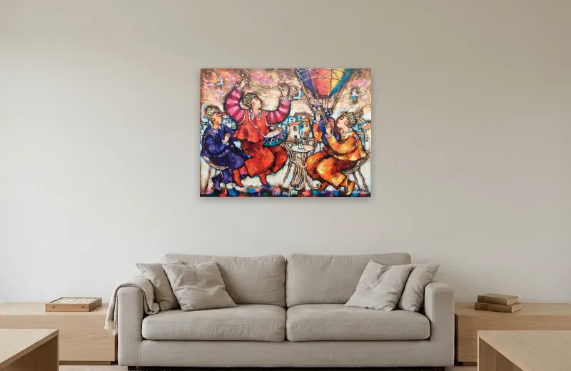
Celebration with a hot air balloon by Michael Kachan. Oil on canvas, 80 × 60 cm; listed unframed. One complete artwork choice in the same family-room setting. Room visualization for illustration; concept only — scale not verified. Artwork © Michael Kachan; room source generated in Gemini.
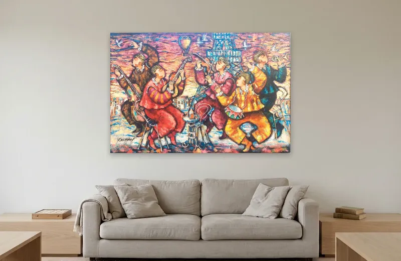
Merry Orchestra in Paris by Michael Kachan. Original oil on canvas, 120 × 80 cm; listed unframed. One complete artwork choice in the same family-room setting. Room visualization for illustration; concept only — scale not verified. Artwork © Michael Kachan; room source generated in Gemini.
Ask the same four questions of both complete choices: Whose reason does this satisfy? Which activity does it accompany? What does it compete with? From which everyday view does it work best?
The research supports a modest conclusion. Viewers differ; domestic objects can carry personal and social meaning; living rooms serve several activities; and people in one specialized shared-home study wanted a voice in collective art. None of these findings proves that a joyful painting will make a family happier, prevent disagreement or improve relationships.
The practical method in this guide—write a shared brief, explain reasons, map sightlines, mark dimensions and compare complete choices—is editorial design reasoning. Its value is transparency: every person can see what is being chosen, why it suits the room and where uncertainty remains.
If the disagreement is mainly about palette or contrast, use the living-room color guide.
If the family agrees on bright work but not on how much visual energy the room can hold, read Vibrant Art That Works in Modern Spaces.
If the unresolved choice is an abstract work and its scale or framing, return to the abstract living-room guide.
A good shared choice need not be everyone’s private favorite. It should be a painting whose visible qualities, meaning and place in the room can be defended by more than one person—and enjoyed without asking the room to behave like a catalog photograph.