









How to Choose Art Colors for Your Living Room
Learn how to choose art colors for your living room by comparing walls, furniture and light, then weighing analogous harmony against deliberate contrast.
Published:
 How to Choose Art Colors for Your Living Room
A painting can pick up the blue in a rug, put a sharp orange against a blue-green wall, or make a room's pale surfaces look richer by comparison. The useful question is what relationship you want to see each day. Start with the room's existing colors, then decide whether the artwork should connect them or introduce a clear difference.
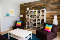
Look from the seat where you spend time, as well as from the doorway. Note the wall's largest color area, the sofa, the rug and curtains, then smaller accents. Include the wood: honey oak and dark walnut contribute different colors even when neither is called an accent.
Use actual paint and fabric samples where possible. A cream wall may lean yellow beside a clean white canvas; a gray sofa may reveal a violet cast beside green. When matching artwork to wall color, compare these undertones before hunting for the same named shade.
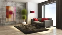
Give the painting a role. A connection might repeat a rug's blue in a smaller passage of paint. A focal point might introduce a saturated hue absent from the furniture. If you want art that matches living room colors, choose which relationship matters most; repeating every cushion color can make the decision unnecessarily restrictive.
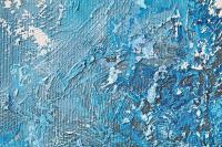
The Getty guide to formal analysis distinguishes hue, value and intensity. Hue is the color family: blue, green or orange. Saturation describes how vivid or muted it appears. A grayish blue wall and an intense turquoise sea can share a family while making very different demands on your attention.
Value means lightness or darkness. A pale blue painting may recede against a pale wall even when the hues differ, while a deep blue passage creates a stronger boundary. Squint at the room and the artwork thumbnail to notice the large light and dark areas before studying details.
Color temperature describes a relative warm or cool tendency. Orange usually reads warmer than blue, but a blue leaning toward violet differs from one leaning toward green. Judge the colors beside one another. These terms help explain a choice; they do not predict that every viewer will find blue restful or red stimulating.
Coordination works through a recognizable connection. A small blue area in a painting can answer a blue textile without making the entire canvas blue. Allow its other colors and its subject to retain their own interest. A room assembled over years rarely needs every object to share a palette.
Analogous colors sit beside one another on a color wheel, such as blue, blue-green and green. They offer a way to connect a painting with a wall while allowing movement within the image. In Coming Home, turquoise water leads into green land, but the white cliffs supply a separate light-dark contrast. Related hues do not remove the need to inspect value and composition.
Browse the Analogous Color collection to compare neighboring palettes across different subjects. The guide to analogous color harmony explores that relationship in more depth.
An orange passage against a blue wall creates a complementary direction on a traditional artist's color wheel. Real paint and textiles seldom form a perfect textbook pair. You can still use their difference: decide whether a small warm accent or a broad warm field should interrupt the room's cooler colors. Blazing Ruby Sunset offers both a concentrated yellow-orange glow and surrounding violet.
A strong contrast can work in a room that already has color. Check which area catches your eye first, and whether that is where you want attention. For more on handling a vivid focal point in a modern interior, see Vibrant Art That Works in Modern Spaces.
Daylight and your evening lamps can change how the same painting appears. Compare it in indirect daylight and under the lamps you normally use. Warm light may make cream and orange more prominent; the result depends on the light source and the artwork's materials. Screens and photographs also vary, so request a clear frontal image and surface details before making a close color match.
The National Gallery of Art explains in its record for Monet's Rouen Cathedral, West Façade, Sunlight that he moved between canvases to capture changing light and atmosphere. At home, check the painting against its intended wall rather than judging it on a white shopping screen. Strong surrounding color also affects perceived contrast. For the painting's care, the Canadian Conservation Institute advises avoiding direct sunlight and prolonged light exposure, which can cause fading.
A frame changes where the painting ends and the room begins. Pale wood may connect with an oak table; black can draw a firm outline; an off-white mat can separate a work on paper from a colored wall. Compare the mat with the paper itself before choosing a bright white that makes the sheet appear yellow.
Framing also depends on the object. A canvas with finished edges may suit an unframed presentation, while a float frame can leave those edges visible. Works on paper need suitable mounting and glazing. Ask the artist or a framer about the support and protection needed; the medium alone does not establish whether a canvas is glossy or ready to hang.
For placement, measure the complete outer assembly. A mat, float gap or frame profile can enlarge the footprint. Keep the artwork at its actual dimensions when comparing treatments. Both works below are listed without frames, and the room concepts show them without added frames or mats.
These works offer different decisions rather than interchangeable color samples. Their subjects, marks and dimensions contribute to their presence. The following room concepts keep the background, camera and light fixed. Since the paintings differ in size as well as palette, use the comparison to consider the whole choice, not to isolate a color effect.

Coming Home
Gill Bustamante · Oil on Canvas
101.6 × 101.6 cm · Unframed
Original catalog photograph · View this coastal oil painting

Blazing Ruby Sunset
Elena Ginsburg · Acrylic on Canvas
50 × 50 cm · Unframed
Original catalog photograph · View this acrylic sunset painting
In Gill Bustamante's Coming Home, the white cliff curves through turquoise water toward green headland. Long strokes across the sea pull the eye diagonally, while the small white bird creates a second point of attention. The pale cliff is essential: it keeps the neighboring blues and greens from reading as one undivided field.
On her official About Me page, Bustamante describes her broader practice as combining semi-abstract techniques with a connection to real places. She also explains that she paints largely from memory. This describes her general method rather than the specific making or intention of Coming Home.
Against the muted blue-green wall in this concept, the sea shares a hue family with the room but carries greater saturation. The oatmeal sofa and light curtains connect with the cliff's pale areas through value. This is coordination with variation: the room repeats parts of the painting's language while the coastline remains its subject.
Choose this direction if you want continuity with blue or green textiles and still want the picture to register clearly. On a very pale wall, examine the cliff's edge carefully; a frame may help define that boundary. Listed specifications: oil on canvas, 101.6 x 101.6 cm, not framed.
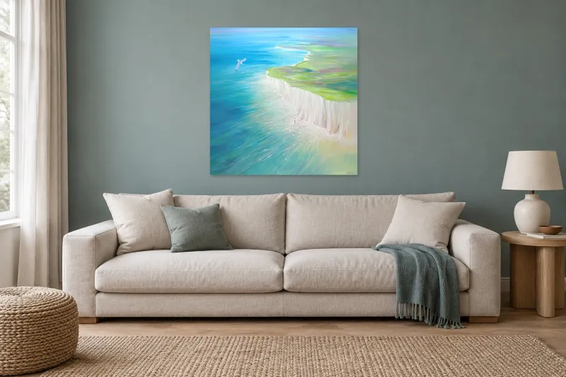
Concept only — scale not verified
Gill Bustamante, Coming Home, oil on canvas, 101.6 x 101.6 cm, unframed. Blue and green connect the painting to the wall and textile. Room visualization for illustration. Concept only — scale not verified. Refer to the product page for dimensions and specifications. View Coming Home
Elena Ginsburg's Blazing Ruby Sunset gathers yellow and orange around the horizon, then moves through pink into violet. Broken white strokes cross the sky, and darker purple bands give the foreground weight. Its brightness has a structure: the central glow draws attention while the dark lower area holds it in place.
The orange-yellow center creates a warm interruption against the same blue-green wall. The violet surrounding it adds another relationship, so this is more complex than a simple orange-blue pairing. At the listed 50 x 50 cm, the work is also much smaller than Coming Home. Strong saturation can make a smaller picture noticeable, but it does not make the two works equivalent in physical presence.
Choose this direction if you want the artwork to introduce a new color emphasis. You could repeat a little violet in a textile, but the painting does not require an orange accessory to justify it. Listed specifications: acrylic on canvas, 50 x 50 cm, not framed. Neither its medium nor its vivid palette establishes a particular gloss level.
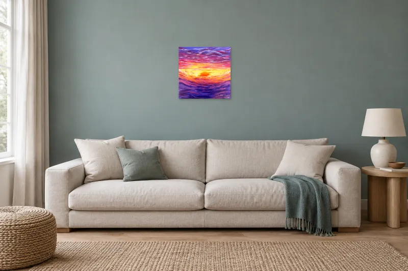
Concept only — scale not verified
Elena Ginsburg, Blazing Ruby Sunset, acrylic on canvas, 50 x 50 cm, unframed. Orange and yellow make a warm contrast with the same blue-green wall. Room visualization for illustration. Concept only — scale not verified. Refer to the product page for dimensions and specifications. View Blazing Ruby Sunset The source's slightly irregular painted edge is preserved; only the surrounding dark background was masked.
When choosing a painting color palette, return to the actual room and the work you want to live with. A convincing connection should survive a change of cushions. Use this short check before buying.
Identify the wall, sofa, textile and wood colors that occupy the largest areas. Check their undertones with physical samples.
Choose the artwork's role: connect an existing color, extend a group of neighboring hues, or introduce a deliberate contrast.
Compare saturation and light-dark structure as well as hue. Look from your normal seat and from the doorway.
Review the work in indirect daylight and under your usual evening lighting. Request better photographs if a close match matters.
Confirm artwork dimensions, frame inclusion, total outer dimensions, hanging requirements and current availability on the product page.
Check that you respond to the subject and marks as well as the palette. Leave room for the painting to contribute something you did not already own.
Use the Cool Color collection to compare blue, green and related cooler palettes without assuming they all create the same mood. For a more pronounced color emphasis, the Vibrant Color paintings for living rooms bring together vivid choices across styles.
If color is only one part of your decision, the Best Abstract Paintings for Living Room guide addresses the broader choice of abstract work. Start with a few paintings you want to look at closely, then test how each one changes the room's existing relationships.