



Uplifting Art for the Workplace
Choose positive office art by matching the work to its users, activity, sightline and shared identity, then test the shortlist with the people who will live with it.
Published:
 Uplifting Art for the Workplace
“Uplifting” is not a specification. For one team it may mean a visual pause between concentrated tasks; for another, energy in a social area or a work that invites conversation without becoming a corporate slogan. Start with the people, the activity and the wall: who will see the work, from what distance, for how long, and beside which screens, signs or windows?
Yes, when practical. Set the budget, installation and content boundaries first, then ask a representative group to compare a small, viable shortlist. Research supports meaningful input into the environment, but it does not promise that a painting will increase productivity. Nor does it promise that every preference can win.
Not automatically. A personal sightline must work during repeated peripheral viewing; meeting-room art should leave screens and writable surfaces legible; break areas can often carry more visual energy or detail. The section “Choose by zone, not by a single office-wide mood” turns those differences into a practical test.
Name the contribution you want in plain language: quiet focus, visible energy, conversation, local connection or an approachable shared focal point. Also record subjects that would be unsuitable for the audience. This brief is more useful than choosing by color alone because the same bright yellow can feel expansive in an open composition and insistent when it is pressed against heavy contrast.
Catalog labels are discovery tools, not room instructions. Bright Day by Irena Budagov is listed with Modernism among its styles, but that does not mean it belongs only in a modern interior. What matters here is visible: broad white and yellow fields are cut by a dark blue-black diagonal and blue drips. The composition has few major parts, yet its contrast gives it force.
An office is not one viewing condition. A work that gives a corridor a clear point of orientation may become a persistent distraction beside a monitor; a painting that rewards a pause may be wasted where people only pass at speed.
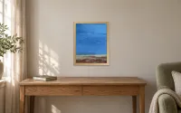
Check both direct and peripheral views from the actual chair. Pale color is not automatically calm, and detail is not automatically distracting; the test is whether the structure remains comfortable during the work being done. Transcendent Springtime by Gill Bustamante offers a useful distinction. A broad blue sky and bands of yellow-pink meadow read across a room, while scattered marks and a small hare near the lower center emerge at closer range. That makes an uplifting oil landscape with open space and small details worth testing in both a quiet work zone and a shared lounge. It does not guarantee calm, but it supports two speeds of looking.

Transcendent Springtime, Gill Bustamante, 2023, oil on canvas, 121.92 × 91.44 cm; product listed as unframed. Individual responses to its open landscape and scattered detail will vary.
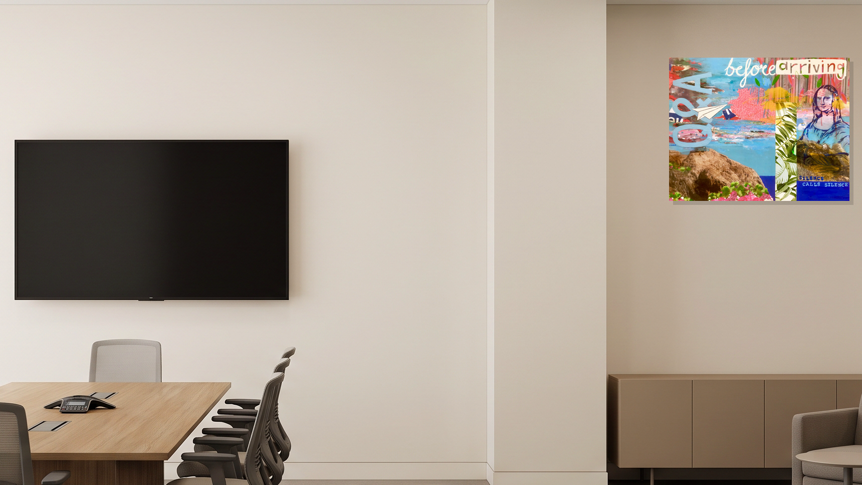
Meeting rooms already contain competing systems: a display, camera, whiteboard, speakers and other people’s faces. A dense work can be engaging, but it should not fight the surface everyone must read. Q&A by Maria Burgaz layers oversized letters, landscape fragments, a paper airplane, plants, embedded text and a familiar art-historical figure across blue and pink passages. The eye keeps finding another visual clue. That makes a layered mixed-technique artwork for a shared conversation space more persuasive on a side wall or arrival sightline than directly behind the presentation screen.

Q&A, Maria Burgaz, 2025, mixed technique, 92 × 73 cm; product listed as original and unframed. Its conversational potential is a visual interpretation, not a measured workplace effect.
Corridors favor a clear distance read; break areas can reward a second and third glance. Budagov’s bold acrylic painting for a shared office area reads clearly at a distance and could hold a long wall with relatively few shapes. Yet its dark diagonal also has directional energy, so test it against signs, screens and other strong graphics rather than assuming open areas equal low visual impact.

Bright Day, Irena Budagov, 2025, acrylic on canvas, 120 × 90 cm; product listed as unframed.
Participation works best when the choices are real and the constraints are visible. First set budget, installation, accessibility, durability and subject boundaries. Then invite a small group that represents different roles, work patterns and locations, rather than only leadership or design staff, to compare feasible candidates in the intended zone.
Ask everyone the same questions: What draws attention? What distracts? What feels credible for the work and the organization? Is there any concern that would block use? Record reasons rather than only votes. A split response may call for a different placement, a temporary pilot or a rotating display rather than a winner-takes-all decision.
This approach respects the limits of the evidence. In Craig Knight and S. Alexander Haslam’s two office experiments, enriched environments combined art with plants, and employee input into decoration was part of the comparison. The study supports taking user control seriously; it does not isolate paintings or prove a lasting art-led productivity gain.
Workplace art can connect to place, people, practice or values without illustrating a mission statement literally. Ask whether the connection feels credible and whether the work leaves room for more than one reading. A motivational message that explains itself completely may feel imposed; an ambiguous image can invite conversation, but only if its content suits the audience.
In Christina Smiraglia’s interviews with 19 people at one Australian education-sector nonprofit, participants described social interaction, personal connections, environmental enhancement and learning; the organization’s student-art collection and mission were distinctive parts of that setting. A later survey of the add art Hamburg program found reports of renewed attention and conversation when art appeared in organizations, while the authors acknowledged possible positive-response bias. These studies make identity and interpretation useful questions, not outcomes to promise.
Before buying or hanging, mark the verified artwork footprint on the real wall. If a frame is proposed, mark its outer size separately; all three examples here are listed as unframed. Look from the approach, from seated and standing work positions, through the meeting camera and at close range. Then count the competing visual systems, including screens, dashboards, signs, whiteboards, shelves, graphics and neighboring artworks.
Density is not a synonym for “many colors.” Bright Day has a small number of large forms but strong contrast and direction. Q&A is dense with fragments and text. Transcendent Springtime has an open overall structure with numerous small marks. The useful question is not which is busiest in the abstract; it is which kind of visual demand fits this wall and this activity.
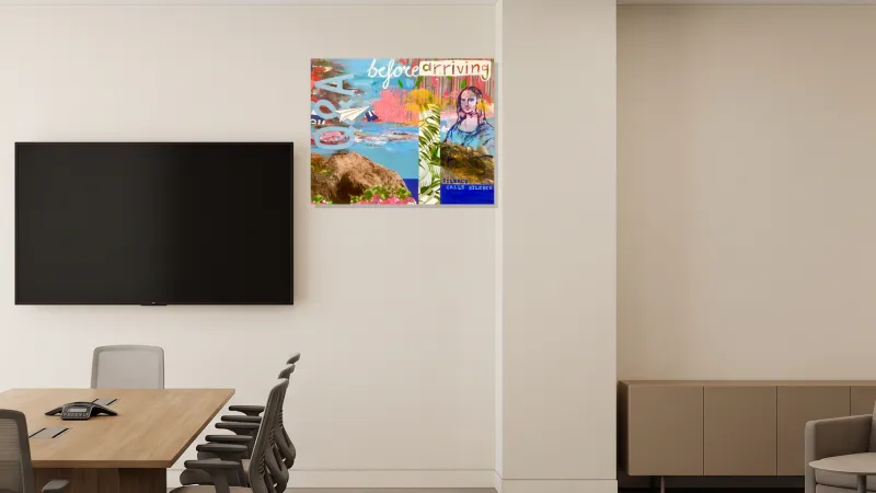
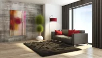
Screen-adjacent placement. Q&A by Maria Burgaz shown beside the presentation screen, where its layered detail competes more directly with meeting content. Room visualization for illustration. Concept only; scale not verified.
Artwork by Maria Burgaz / WeArt catalog source. Blank room generated in Gemini; artwork composited separately.
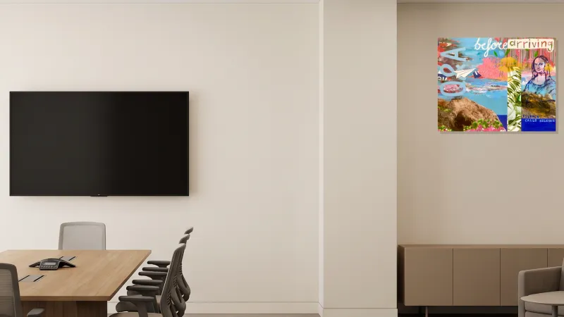
Quieter-wall placement. Q&A by Maria Burgaz shown on the quieter wall above the credenza, separated from the presentation screen. Room visualization for illustration. Concept only; scale not verified.
Artwork by Maria Burgaz / WeArt catalog source. Blank room generated in Gemini; artwork composited separately.
Painting filters can help build a deliberately varied test set. Browse joyful contemporary paintings when you want to compare how different works carry visible energy in a break area, but judge each image rather than assuming a Joy label predicts anyone’s response. Use figurative paintings organized around forms and lines to test another question: does the subject remain legible from the approach, and do its contours or rhythms compete with dashboards and text-heavy screens? These routes narrow the shop; they do not make the placement decision for you.
Distribution matters too. An exploratory survey of 68 employees at Universidad Loyola Andalucía reported uneven exposure between campuses and job groups alongside generally positive perceptions and requests for wider participation. It was a single-university self-report study, not a test of an ideal amount of art, but it suggests a concrete audit question: who actually gets to see the collection?
The evidence is more useful when its different forms are not collapsed into one optimistic headline:
Controlled experiments: Knight and Haslam compared lean, enriched and employee-involved office conditions. Art and plants were bundled, so the result is about environmental enrichment and control, not paintings alone.
Interviews: Smiraglia documented how people in one organization described a workplace collection. Those accounts reveal meanings and uses, not causal performance effects.
Organizational surveys: add art Hamburg respondents described attention, questions and conversation; the study had small samples and possible positive-response bias. The Loyola survey recorded benefits, dissent and uneven access in one university.
Virtual-image survey: Bae and colleagues’ online workplace-image study reported mixed associations between art-appreciation factors and self-reported creativity dimensions. It was not a field installation or objective creativity test.
None of these sources proves that a particular painting, palette or style tag will create universal happiness, concentration or productivity. Their practical value lies elsewhere: involve people, pay attention to context, notice how art is encountered, and review the decision after installation.
Restate the users, activity and positive quality the art is meant to support.
Compare the shortlist in the actual zone, at normal distances and in typical light.
Check conflicts with screens, signage, cameras, circulation and concentrated work.
Record representative users’ reasons and unresolved objections.
Confirm product dimensions, framing or outer dimensions, current availability and installation constraints.
Choose whether to purchase, pilot, rotate, change placement or revisit the brief.
If the shortlist needs expanding, browse hopeful contemporary paintings, then test promising works against the workplace brief. For a deeper interior-design discussion, see how vibrant art can work without making a modern space feel busy. The workplace decision still returns to the same grounded test: this work, these people, this wall, this activity.