








How to Choose Calming Abstract Art for Your Living Room
Choose calming abstract art for your living room by comparing spacing, rhythm, edges and contrast, then considering the surrounding room and frame.
Published:
 How to Choose Calming Abstract Art for Your Living Room
A painting can have very little in it and still feel restless. One hard diagonal may pull the eye across the canvas; a small bright mark can keep calling it back. Another work can be full of texture yet feel remarkably settled. Choosing calming abstract art for a living room begins with that difference: how a picture organizes your attention, rather than whether its colors resemble a paint chart labeled “serene.”
Calm is a personal judgment, not a property a seller can guarantee. The useful question is whether a work gives you something you want to return to, without asking for more attention than you want to give it.
Before deciding whether a painting matches the room, look at it for a while without reading its title. Notice where your eye lands, where it travels and whether it finds a place to pause. Try the same exercise from across the room. Some details disappear at a distance; strong divisions and dark accents remain.
When browsing abstract paintings for living rooms, compare works by asking three questions: Are the marks scattered or gathered? Does the movement repeatedly change direction? Is one contrast doing most of the work? None of these has a universally correct answer. Together, they reveal why two paintings with similar colors can feel quite different.
Visual breathing room need not mean bare canvas. A broad, lightly varied surface can let the eye rest because there are fewer separate events to track. In art history, Color Field painting provides one useful point of reference: painters explored what large areas of color could do without a clearly described scene. That history does not turn every restrained contemporary painting into a Color Field work, or make restraint automatically peaceful. It offers a way to look at relationships rather than search for objects.
Art historian and writer Karen Kedmey’s 2017 essay on Mark Rothko for MoMA describes his pursuit of profound human emotions, rather than color relationships alone. Her account is a useful caution against treating broad fields of color as automatically soothing. This is historical context, not evidence that the contemporary artists discussed here followed Rothko; the observations below come from looking at their individual works.
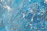
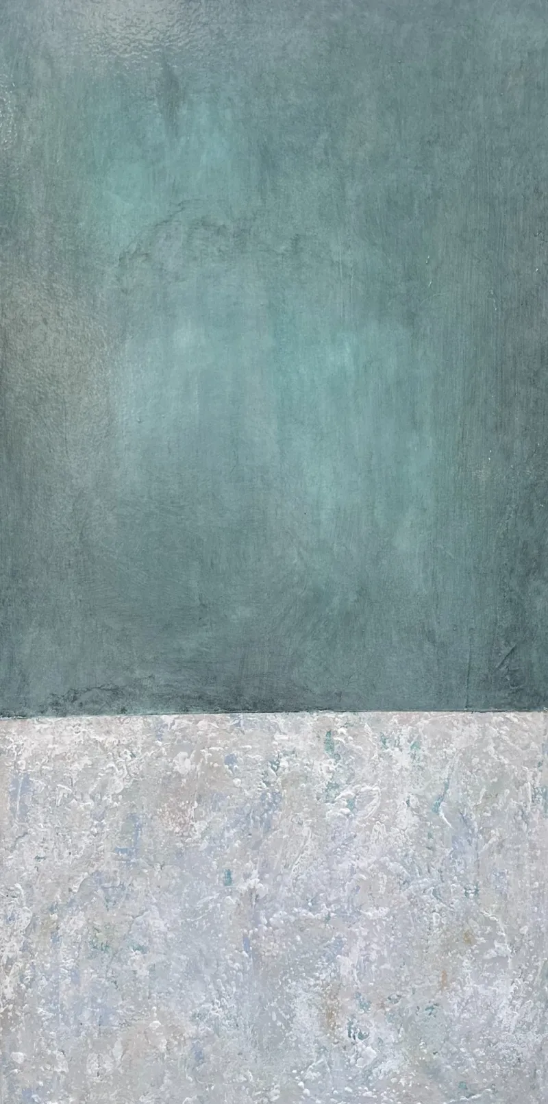
Noell Tarpey’s Undertow, an abstract mixed-technique painting, makes that distinction tangible. A blue-green area takes up most of the tall composition; a smaller, pale area sits beneath it. The boundary between them is fairly steady. Within each area, the surface keeps changing in small increments. There is activity, but it is held inside an uncomplicated arrangement.
Its strongest quality for a quieter room is this division of labor. The large structure is easy to grasp; the texture rewards closer looking. The work may suit someone who wants a painting to feel present without requiring a busy arrangement of shapes.
Undertow — Noell Tarpey. Mixed Technique, 38.10 × 76.20 cm; listed unframed. Image courtesy of WeArt and the artist.
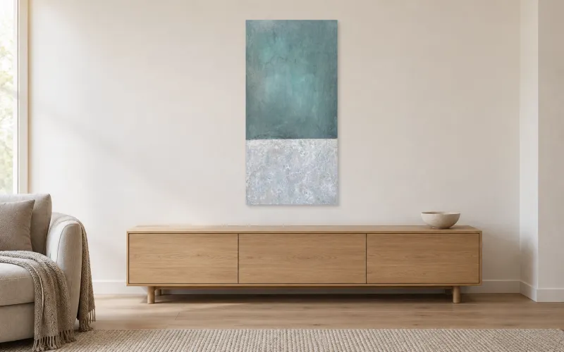
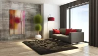
Undertow by Noell Tarpey. Room visualization for illustration. Concept only — scale not verified. Unframed work shown. Refer to the product page for artwork dimensions and specifications.
Repetition can give the eye a pattern to follow. It can also become insistent. Compare the spacing, strength and direction of repeated marks rather than assuming that repeated lines are restful.
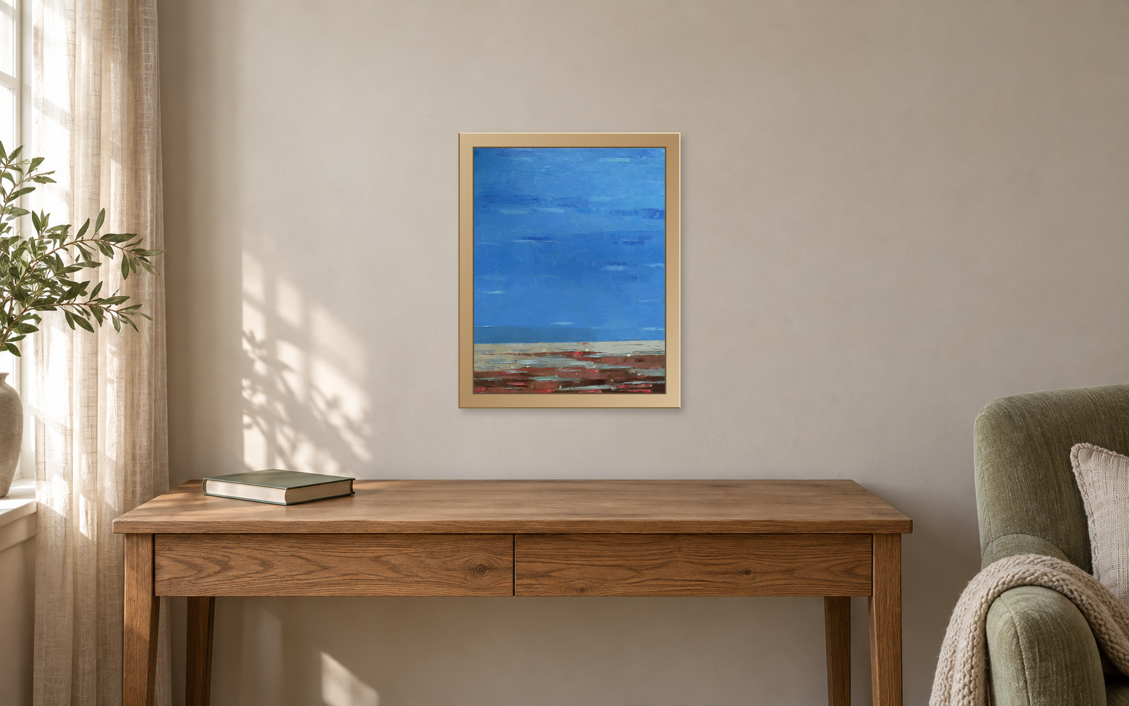
In Kestutis Jauniskis’s Silence, an abstract oil painting on canvas, horizontal scrapes travel across a wide blue area within a small, upright canvas. Near the bottom, the marks gather into a denser strip of gray, rust and red. That lower band matters: it stops the blue from becoming merely a uniform background. The tension is concentrated rather than spread evenly across the picture.
For a living room with patterned upholstery or many objects, this concentration may be easier to live with than a composition that competes at every edge. But the red band could remain the first thing you notice. Give that reaction weight. The title is not an instruction to feel peaceful.
At a listed 24 × 30 cm, this is an intimate work. It should not be treated as if it will fill a broad wall above a sofa. A closer viewing position or a smaller wall area may serve it better.

Silence — Kestutis Jauniskis. Oil on Canvas, 24 × 30 cm; listed unframed. Image courtesy of WeArt and the artist.
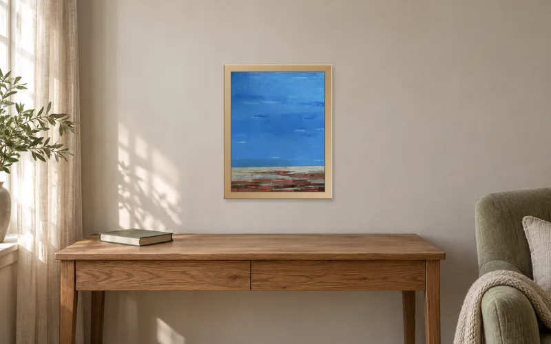
Silence by Kestutis Jauniskis. Room visualization for illustration. Concept only — scale not verified. Frame shown for illustration only; it is not included unless specified on the product page. Refer to the product page for artwork dimensions and specifications.
A crisp boundary gives the eye a clear division. A softened edge makes the transition less definite. Neither is inherently better. A room full of strong outlines may benefit from a painting that does not add another hard interruption; elsewhere, a clear division may provide welcome order.
Benji Moses’s White River, an abstract acrylic painting on canvas, offers a different route from the small scrapes of Silence. A diffuse brown band crosses a pale vertical field. Its edges feather into the surrounding surface, while darker traces remain near the perimeter. The band holds the picture together without describing a detailed scene.
The appeal here is not the absence of contrast. It is the way contrast is kept within a limited area and allowed to soften. For a viewer drawn to this effect, the work can sustain attention without a complicated route through the canvas. Its pale surface could feel subtle against one wall and too indistinct against another; test the surrounding color and actual light before deciding.

White River — Benji Moses. Acrylic on Canvas, 100 × 140 cm; listed unframed. Image courtesy of WeArt and the artist.
Blue can be forceful. A closely related palette can still carry a crowded, fast-moving composition. Conversely, an earth-toned or warm painting may feel measured because its shapes and intervals are well controlled. These three works show why color alone is an incomplete selection rule.
If neighboring hues are part of what attracts you, read the separate Guide to analogous color harmony. For decisions about walls, furniture and textiles, use the Guide to choosing an artwork palette for your living room. Here, keep returning to the structure: what is repeated, what is isolated, and how much of the surface demands immediate notice.
An open field or horizontal division may suggest sky, land or water without depicting a recognizable place. That association can be part of a painting’s attraction, but it should remain your interpretation unless the artist identifies the subject. A title such as Undertow can invite a reading without settling it.
If that connection is important to you, explore nature-inspired abstract paintings. The existing discussion of nature-inspired art and color relationships develops another approach through a specific nature work. A subject you enjoy can help you choose, but trees or water do not guarantee a quiet composition.
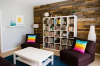
Consider what surrounds the proposed position. A painted edge beside a dark bookshelf reads differently from the same edge on an otherwise empty wall. Leave enough visible wall to distinguish the artwork from nearby furniture, and judge the result from the places where you actually sit or pass through.
Make a paper template using the verified dimensions. Then consider the frame as a separate choice. A strong dark frame may sharpen a quiet painting’s boundary; a restrained treatment may keep attention on the surface. Neither choice is automatically right. Check what is supplied with the product, and use the total outer dimensions when assessing a framed work’s footprint.
The three works discussed here were listed unframed when checked. The product images show the original artworks. The accompanying room visualizations illustrate atmosphere and placement; their physical scale is not verified. The proposed frame around Silence is illustrative and is not included with the listed unframed work. For the wider selection process, consult the broader guide to choosing abstract art for a living room.
Choose two or three candidates and give each a specific reason to stay on the shortlist. “Broad areas with subtle variation,” “a steady horizontal rhythm” and “soft boundaries around one accent” are more useful than simply “calming.” They tell you what you are responding to.
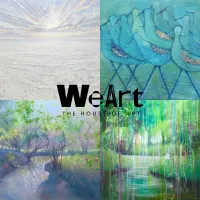
Then return to the pictures after a break. If the same work still interests you, measure its proposed position and check the product details. Browse WeArt’s calm abstract paintings with those observations in mind. The aim is a painting you enjoy spending time with, and a place in the room that allows you to do so.