








Positive Art for Reception and Hospitality Spaces: Creating a Welcoming Atmosphere
Choose positive art for reception areas by defining the welcome you want, then judging each work from the entrance, desk or queue, and seated waiting area.
Published:
A reception space is a threshold. Before anyone reads the brochure, checks in or sits down, the room has already begun to describe the organization behind it. Art can contribute to that description, but only if the intended welcome is specific enough to guide a choice.
Start with the place, not a universal idea of “positive.” A lively abstract can signal creative energy; a landscape can offer a gentler sense of arrival; a figurative work can feel sociable or intriguing. The right choice depends on the people entering, the identity of the venue and how the work looks from their actual route through the space.
Often it should do one job especially well. Art on the main arrival axis needs a clear structure that registers quickly. Art beside a queue, desk or seating area can unfold more slowly through detail, ambiguity or visual wit. A large room may need both kinds of encounter instead of asking one painting to perform everywhere.
“Friendly” is a start, not a brief. Does the venue want to feel playful, assured, quietly optimistic, locally rooted or culturally adventurous? A family hotel, a design studio’s reception and a formal professional office may all want visitors to feel comfortable, yet they should not look interchangeable. Write one sentence naming the main visitors, the activity and the desired tone. That sentence is more useful than a list of fashionable colors.
Then screen for content as well as atmosphere. Subjects involving nudity, religion, politics, distress or sharp humor are not automatically unsuitable for public rooms; their fit is contextual. The important question is whether the work supports this place and these visitors, including people who did not choose to spend time with it.
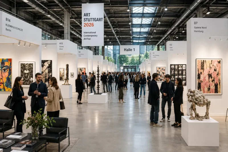
Stand at the entrance and notice what competes for attention: the reception desk, directional signs, doors, screens, plants and people in motion. An arrival artwork needs enough separation from that information to read as a deliberate focal point rather than another rectangle in the visual traffic.

Splashes by Sandra Gross. Original catalog image; acrylic on canvas, 100 × 80 cm, listed unframed.
Splashes by Sandra Gross shows how an abstract work can make a quick first impression without becoming a single block of color. Hot pink and turquoise drops, fine specks and longer drips move across a white field. The surface is busy, but the white intervals keep individual marks distinct. From across a reception room, the eye catches the contrast and rhythm first; closer up, the differences between pools, flicks and trails become more apparent.
That makes an energetic abstract acrylic painting a useful candidate when the intended welcome is lively and informal. It still needs breathing room. Put it behind patterned furniture, beside a digital display or directly above dense signage and the same lively surface may become visual noise. Readers looking for a broader range can browse joyful Modernist paintings, but the shop filters are only a discovery tool: the individual image and room decide whether the energy feels generous, hectic or somewhere between.
If the first reading should be representational rather than abstract, fine art landscape paintings provide a narrower place to look. Test each work from the doorway, because the filter says nothing about how calm, energetic or welcoming it will feel in this room.
The practical test is simple. Walk toward the work from the door. If it disappears behind people at the desk, merges with nearby graphics or only becomes coherent when you are already beside it, it is not functioning as the arrival focal point you intended. The remedy may be a clearer wall or a different placement, not a louder painting.
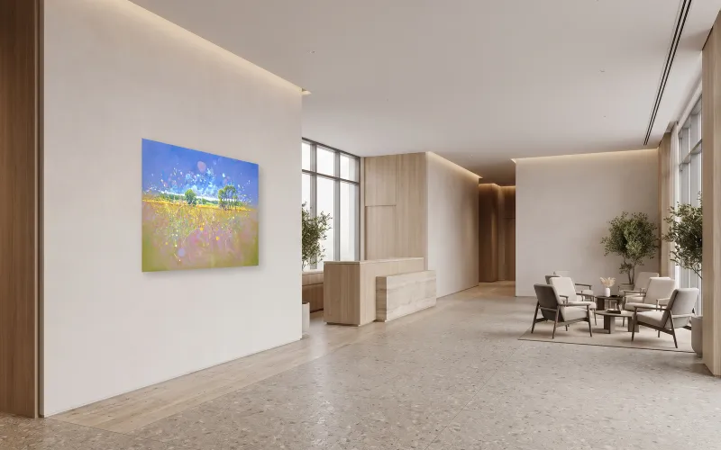
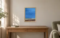
Clear focal placement. Transcendent Springtime by Gill Bustamante in a clear arrival-wall focal position. Room visualization for illustration. Concept only. Scale not verified.
Artwork: Gill Bustamante; catalog image: WeArt. Blank room generated with Gemini; artwork composited separately from the verified catalog original.
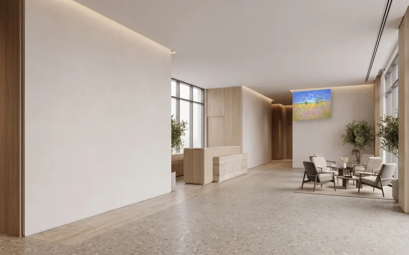
Less-prominent placement. Transcendent Springtime by Gill Bustamante in a less-prominent position on the distant right-hand waiting-area wall. Same room and artwork; placement changes only. Room visualization for illustration. Concept only. Scale not verified.
Artwork: Gill Bustamante; catalog image: WeArt. Blank room generated with Gemini; artwork composited separately from the verified catalog original.
At the desk or while queuing, visitors are neither passing straight through nor settling in for a long look. Their attention moves between staff, forms, phones, luggage and other people. Art here can offer a moment of focus, but it should not obstruct essential information or introduce a subject that feels careless for the audience.
Set it Free by Hadar Raanan is a useful example of why mood words are not enough. A reclining grey figure stretches across the canvas while a black cage-like form sits over the torso and colored butterflies rise into the open space. The contrast between enclosure and flight can support a reading of release. Yet the reclining nude and cage imagery also make the work more charged than a generic “uplifting” label suggests.
In an adult boutique hotel or art-led venue, a symbolic acrylic painting exploring freedom might support an atmosphere of independence or transformation. In another setting, it could pull attention away from the welcome the organization wants to give. That is not a blanket ban for a reception area; it is a reminder to judge subject, audience and institutional identity together.
The same audience check applies to familiar subjects: contemporary animal paintings can be playful, watchful, symbolic or intense; judge the particular animal, pose and treatment instead of assuming the theme itself is welcoming.
Queue sightlines also reward restraint. A single work can hold attention more gracefully than a cluster squeezed between notices. If the wall must carry operational information, give the artwork a separate visual zone. The goal is not to turn waiting into an exhibition. It is to make the room feel considered while visitors still understand where to go.
Seated visitors see the room differently. Their viewpoint is lower, their angle may be oblique and their attention can return to the same wall several times. Here, a painting does not need to announce everything in the first second. It can offer a stable large-scale shape and smaller discoveries that arrive later.

Transcendent Springtime by Gill Bustamante. Original catalog image; oil on canvas, 121.92 × 91.44 cm, listed unframed.
In Transcendent Springtime, Gill Bustamante builds that double reading. A broad blue sky and low band of trees organize the image from a distance. In the foreground, yellow, pink and green marks scatter across the field; a small hare waits near the lower center, easy to miss on a first glance. The recognizable horizon provides an entry, while dots, drips and pale bursts keep the surface from becoming a conventional scenic view.
For a lounge or seated waiting area, a hopeful semi-abstract oil landscape that rewards a slower look can support a gentler welcome without fading into background decoration. “Hopeful” here is an editorial reading of the open horizon, spring color and emerging detail, not a promised response. Visitors may find the same palette buoyant, dreamy or simply bright. The shop also offers a filtered view of hopeful contemporary paintings, where this work is listed.
If a waiting area needs recognizable forms and more visual narrative, figurative landscape paintings offer another focused route. Compare individual compositions from seated distance rather than assuming every landscape will feel calm.

Summer Party by Roman Zuzuk. Original catalog image; watercolor on paper, 51 × 35 cm, listed unframed.
Not every waiting-area work needs to dominate a large wall. Summer Party by Roman Zuzuk compresses its action into a much smaller sheet. A group of stylized dancing figures moves across red ground, with angular limbs, lifted poses and orange hair creating a comic rhythm against rounded green hills. The image feels sociable because the bodies answer one another; its play comes from gesture and exaggeration rather than sheer saturation.
At 51 × 35 cm and listed unframed, a playful figurative watercolor with dancing figures is better suited to conversational distance, a boutique desk or a carefully spaced group than to a distant lobby wall by itself. A mat and frame would change the total footprint, so plan those outer dimensions before judging scale.
Product dimensions are the beginning of the placement decision, not the end. Mark the complete proposed footprint on the wall at actual size. For an unframed canvas, that starts with the listed artwork dimensions. For a paper work, include the proposed mat and frame. Do not compare a bare sheet with a framed canvas as though their listed dimensions describe the same thing.
Then check four positions:
1. The entrance: Is the work visible before the desk, signs or doors obscure it?
2. The approach to the desk: Does it remain coherent while people and furniture cross the view?
3. The queue: Can visitors look at it without missing operational information?
4. The seats: Is the center of the composition comfortable from a lower and possibly angled viewpoint?
Also check the room when it is busy, not only when it is empty. A painting that commands a quiet photograph may vanish behind a line of guests. Lighting matters too, but do not use a spotlight so harsh that it changes the work’s color or produces glare. If the wider interior already carries saturated upholstery, patterned rugs and moving screens, the useful lesson may be to reduce competition around the art. WeArt’s guide to using vibrant art without making a modern interior feel busy explores that broader styling question.
A 2026 mixed-method study of art engagement in luxury hotels by Luyang Wang and colleagues began with 15 interviews and followed with a survey of 268 luxury-hotel customers. The authors describe artistic engagement through attention holding, cognitive enquiry and emotive immersion, and they tested its relationship with customers’ overall hotel experience.
That is useful because it treats hotel art as something guests may notice, think about and feel involved with, rather than merely as a color patch over a sofa. It does not prove that the art caused a better stay, that one style works for all guests or that luxury-hotel findings apply automatically to a medical reception, public office or budget accommodation.
Another experiment, Brieber and colleagues’ museum-versus-laboratory study, found that context affected viewing time and evaluations of the same set of art photographs. Its setting is far removed from a reception desk, so it cannot tell you where to hang a painting or which palette to choose. It does reinforce a modest principle: the experience of art is shaped by where and how it is encountered. The practical route tests in this guide are design reasoning built on that principle, not experimental findings of their own.
1. Name the welcome. Write one sentence describing the visitors, activity and quality the space should convey.
2. Choose the encounter. Decide whether each work is primarily for arrival, the desk or queue, or seated waiting.
3. Mark the real footprint. Use verified artwork dimensions and include any proposed frame or mat in the outer size.
4. Walk and sit. Check the entrance, approach, queue and seats under ordinary daytime and evening light.
5. Record one fit and one friction. A work may suit the venue’s energy yet compete with signage, or fit the palette while feeling too quiet from the door.
6. Recheck the product. Confirm availability, medium, frame status and current specifications before purchase.
A welcoming reception is not created by choosing the brightest painting and hoping for the best. It comes from aligning the work’s visible character with the identity of the place and the way people actually move, pause and look. When those choices agree, art does more than fill a wall: it gives the arrival a point of view.