





Uplifting Art Themes: Nature, People or Abstract Forms?
Choose uplifting art themes by comparing not only what a painting shows, but how gesture, line, spacing, color and ambiguity shape its presence.
Published:
 Uplifting Art Themes: Nature, People or Abstract Forms?
Nature can offer a sense of openness, people can bring sociability or intimacy, and abstract forms can supply movement without prescribing a story. None of those qualities belongs to a subject automatically. The useful question is more precise: what kind of nature, company or movement would you enjoy meeting each day?

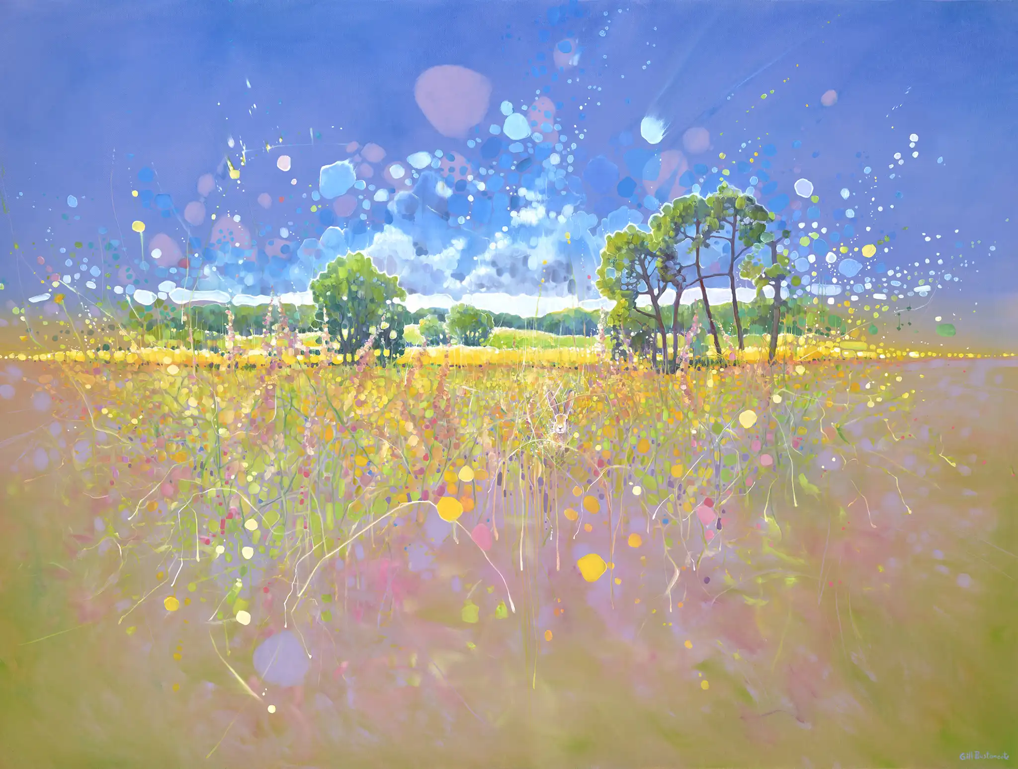
Transcendent Springtime by Gill Bustamante, oil on canvas, 121.92 × 91.44 cm.
No. A landscape can feel spacious, vigorous, hushed or ominous depending on its horizon, weather, color, brushwork and density. Look past the noun landscape and ask how this particular painted world moves.
Portraits give us recognizable cues—gaze, posture, expression and social setting—while abstract art leaves more room for private associations. Yet either can feel immediate or remote. The particular work and the viewer matter more than the category alone.
Start by deciding which subjects, figures or non-literal forms you are happy to live with. Then compare treatment: movement, space, contrast, detail and ambiguity. That second step is where a broad theme becomes a real choice.
The word “uplifting” is too broad to guide a purchase until you give it a shape. Do you want an image that feels expansive, companionable, playful, hopeful, curious or quietly assured? Two people can both want a positive atmosphere and choose opposite paintings because one wants a lively focal point while the other wants visual breathing room.
Write down one desired quality, then test every candidate against the same five questions:
Subject cue: What do I recognize first, and what associations does it bring?
Movement: Do lines, bodies or marks rise, drift, circle, scatter or hold still?
Space: Does the picture open outward, press forward or flatten into an all-over field?
Color and contrast: Is its energy carried by saturation, light-dark contrast, warmth, restraint or a small accent?
Ambiguity: How much story does the work supply, and how much do I bring?
This keeps the comparison fair. It also prevents a catalog label from doing the looking for you.
In Transcendent Springtime, a low field of yellow, pink and green stretches beneath a generous blue sky. Trees hold the middle distance, but circles, drips and pale bursts loosen the view. A small hare appears near the lower center almost as a reward for slowing down.
The painting's positive charge does not come from “nature” in the abstract. It comes from openness and activity working together: the horizon gives the eye distance, while the dispersed marks keep the field alive. That makes a hopeful semi-abstract oil landscape with a small hare a useful choice for someone who wants recognition without strict realism.
A familiar landscape can carry very different energy. The National Gallery describes Vincent van Gogh's A Wheatfield, with Cypresses through its powerful rhythmic lines and swirling brushstrokes—nature made vigorous rather than passive. This is a comparison of pictorial treatment, not a claim that Bustamante follows Van Gogh.
Animals also change their role from picture to picture. A bird can propel the eye through the sky; a horse can become the main character; a small creature can be a quiet discovery. Before calling an animal painting cheerful, ask whether the animal acts as companion, symbol, protagonist or punctuation.
Summer Party by Roman Zuzuk does not depend on detailed likeness. A group of stylized figures lift, lean and dance across a red foreground. Their angular limbs, tipped bodies and flying orange hair turn the group into a comic rhythm; the social action reaches us before any individual personality does.

Summer Party, watercolor on paper, 51 × 35 cm. The unframed paper work is shown as the catalog original.
If you want a room to feel sociable, a playful figurative watercolor driven by dancing figures can provide that cue without relying on smiles or photographic detail. The movement is carried by bodies, spacing and repetition.
There is a useful historical comparison in MoMA's account of Henri Matisse's Dance (I). MoMA notes how simplified bodies, reduced color and economical line give the linked figures their rhythm. Again, this does not establish influence on Zuzuk; it shows why “people” is too blunt a description. A figure painting can be portrait, encounter, performance, crowd or pattern.
To explore that boundary, browse figurative paintings with abstracted forms and notice how long the body remains legible before flat shape, repetition or rhythm takes over. The mixed route is a starting point, not a promise that every work balances recognition and abstraction in the same way.
A portrait may offer a quieter kind of company. Guardians by Nataliya Bagatskaya places a seated woman frontally between two black cats. Her pale face and white drapery emerge from a nearly black ground, while the cats' bright eyes reinforce the symmetry. The effect can read as composed, watchful, protective or reserved, depending on what the viewer brings to that direct gaze.

Guardians, acrylic on canvas, 60 × 80 cm.
This poised acrylic portrait of a woman and two watchful cats is useful precisely because it refuses a one-word mood. Its subjects are recognizable, but its emotional tone remains open. That complexity may be uplifting for someone who values steadiness and self-possession more than exuberance.
The same image also shows why subject filters need a second question. If the cats are your point of entry, anti-realist animal paintings let you compare departures from strict naturalism in anatomy, setting or symbolism. If the woman's direct gaze matters more, anti-realist paintings of women shift the comparison toward pose, agency and stylization. Neither route guarantees a positive mood; open the individual works and judge what their treatment does.
Splashes by Sandra Gross offers no figure or landscape to name. Instead, hot pink, turquoise, blue, orange and yellow marks scatter across white. Large drops, fine specks, arcs and downward drips create uneven rhythm, while the untouched intervals keep the surface from becoming a solid wall of noise.

Splashes, acrylic on canvas, 100 × 80 cm.
The absence of a depicted subject does not mean the absence of character. In an energetic abstract acrylic painting built from splashes, drips and open white space, the reader can respond to tempo and balance before attaching a story. One person may see celebration; another may enjoy the tension between accident and control.
The Guggenheim's discussion of Kandinsky is a useful reminder that abstraction need not carry a single emotional instruction. Its collection text on geometric forms describes interactions that can be dynamic and calm, aggressive and quiet at once. Those terms belong to Kandinsky's work, not Gross's, but the principle helps: follow relationships among forms instead of trying to decode each color or line as a fixed symbol.
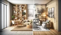
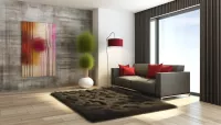
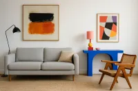
The room pair below holds the wall, furniture, lighting and camera still while the artwork changes. It shows how the nature work opens a broad luminous field and the people work concentrates energy in a smaller social scene. Because the room is generated and unmeasured, use it to compare atmosphere and relative presence—not verified installation scale.
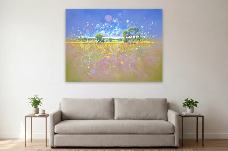
Transcendent Springtime by Gill Bustamante in the fixed comparison room. Editorial atmosphere concept; scale not verified. Artwork: Gill Bustamante / WeArt catalog source. Room visualization for illustration.
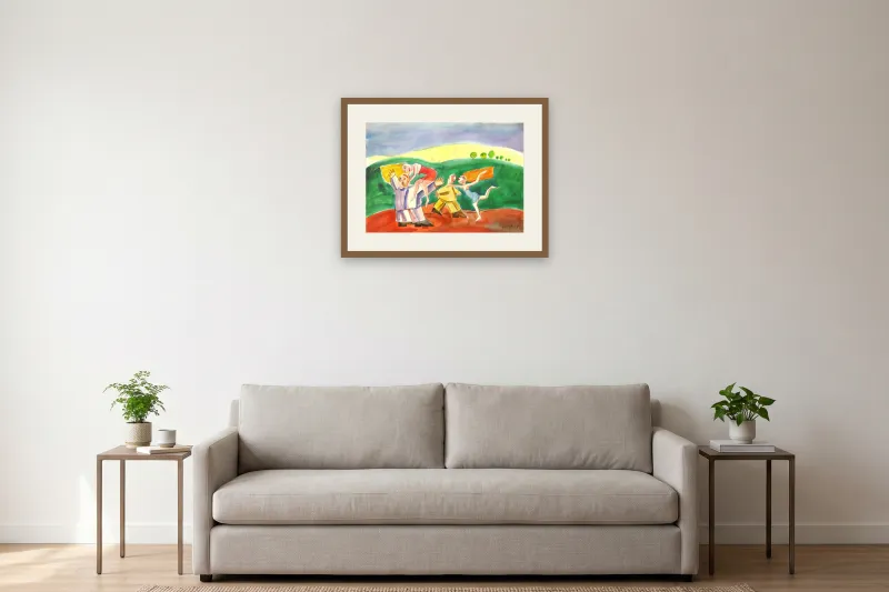
Summer Party by Roman Zuzuk in the same comparison room. Frame shown for illustration only and not included unless specified on the product page; scale not verified. Artwork: Roman Zuzuk / WeArt catalog source. Room visualization for illustration.
The room pair makes one contrast immediate, but the same method also applies to abstraction. Put one nature work, one people work and one abstract work beside each other. Then ignore their category names for a minute and use the same questions:
Factor Nature example People example Abstract example Your decision First cue Horizon, trees, hare Dancing group Colored marks Which cue starts associations you welcome? Movement Marks rise and disperse Bodies lean and link Splashes scatter and drip Do you want lift, company or pure tempo? Space Deep, open landscape Shallow stage-like scene All-over white field Should the work open the wall or activate its surface? Contrast Luminous pastel shifts Red, green and yellow bands Saturated color on white How strongly should the work announce itself? Ambiguity Recognizable place with loose marks Readable action with stylized figures No prescribed subject How much story do you want supplied?Now add one friction point for each candidate. The landscape may become too soft at a long viewing distance. The figurative work may feel too specific for every user. The abstraction may compete with patterned furnishings. A useful shortlist contains both attraction and doubt; that is how preference becomes a practical decision.
Shop filters are useful starting points, not verdicts. You can browse hopeful contemporary paintings to compare recognizable and semi-abstract subjects, or explore joyful Modernist paintings for different kinds of color and structure. Then open the individual work and look again.
For each candidate, verify the medium, dimensions and frame information on its product page. View the full image rather than a small listing crop. Ask what attracts you before reading the mood tags; then see whether the details support or complicate that first response.
If the room relationship becomes the harder question, use the guide to choosing art colors for a living room. For non-literal work, the guides to choosing abstract paintings for a living room and comparing spacing and rhythm in calming abstract art carry the decision into scale, framing and placement. The narrower nature guide explores analogous color in a nature painting.
A small study of strongly moving aesthetic responses found substantial differences in how people rated the same artworks, with personal relevance playing a role in intense responses. That supports asking what a work connects to in your own life; it does not predict a permanent mood benefit.
In a study comparing portraits and abstract artworks, expertise, familiarity, brief training and viewing context affected parts of aesthetic evaluation, while the categories also differed in arousal. Another set of experiments found more shared liking and association patterns for representational than abstract art. These are bounded studies with selected works and participants. They help explain why a face may provide more common cues and an abstraction more private ones; they do not prove which will make your room positive.
Choose the painting whose subject you welcome and whose treatment supplies the positive quality you actually named. Then test it at the intended viewing distance, using its real dimensions rather than the apparent size of an online image. The right theme is not the one with the happiest label. It is the one whose particular world—open field, dancing company, watchful presence or unruly color—you want the room to keep offering.