


Brightness Isn’t Cheerful: Rethinking Bright Expressionism in Modern Art
Color in expressionist art isn’t about harmony — it’s about urgency, instinct, and emotional exposure.
Published:
 Brightness Isn’t Cheerful: Rethinking Bright Expressionism in Modern Art
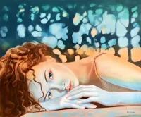
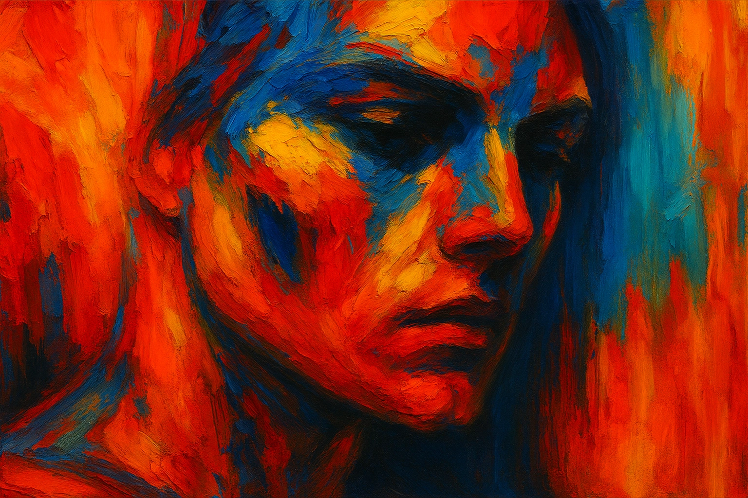
When most people see a canvas with bright reds, acrid yellows, and electric blues, their immediate reaction might be: "This feels vibrant, even cheerful."
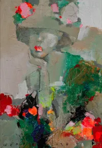
But in the world of bright expressionism, color is as likely to have to do with what happens to the mind as how things look. It is not there for decoration; it is there to lay bare.
Historically, expressionist artists rejected realism in favor of unbounded, innate gestures and emotional depth. That attitude went for their handling of color as well. Instead of natural or "sweet" palettes, they used sharp, even cutting colors. This was thrown in the face of viewers as a challenge to something they had to try to get beyond before connecting with what lay beneath.
Beyond the Surface: What Bright Colors Actually Convey
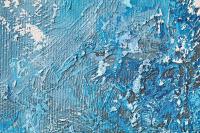
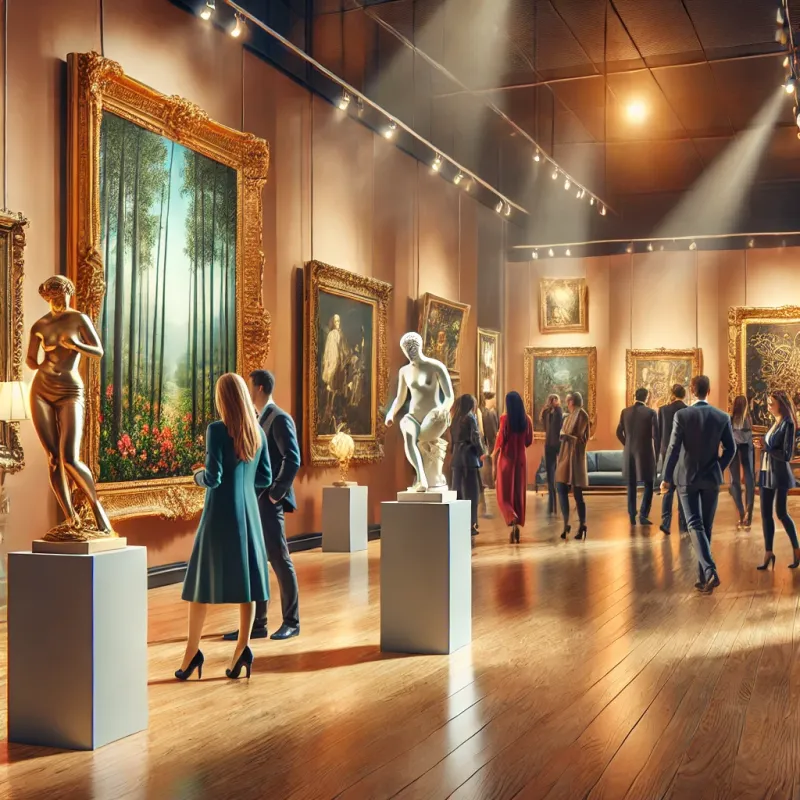
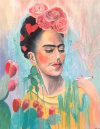
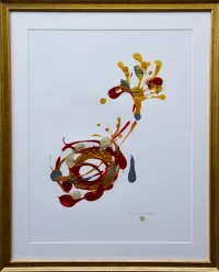
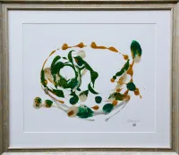
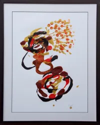
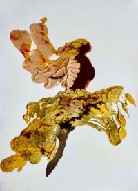
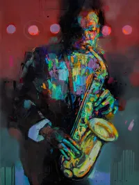
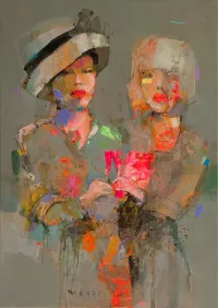
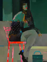
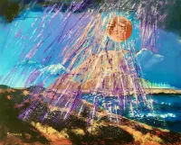
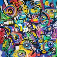
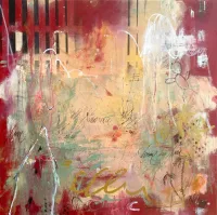
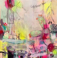
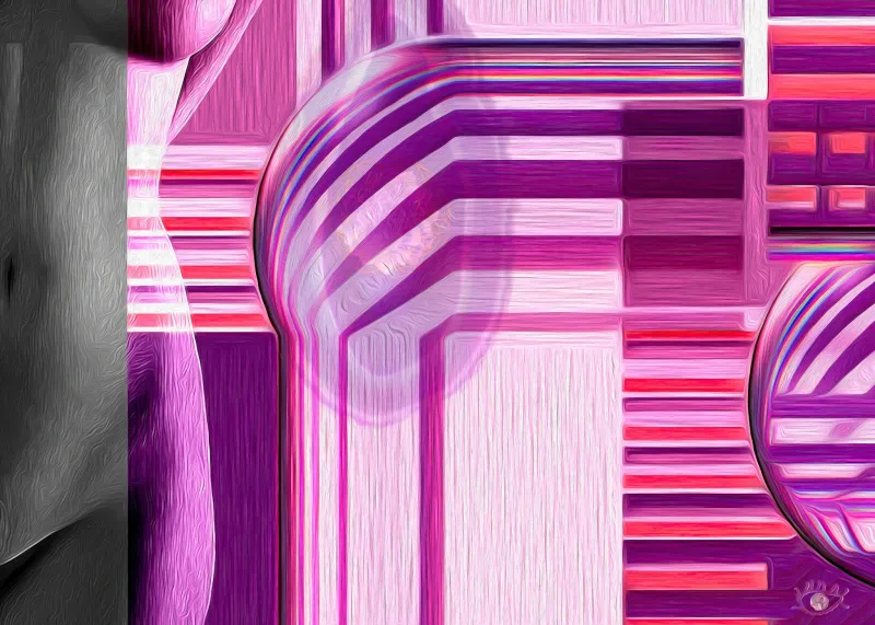
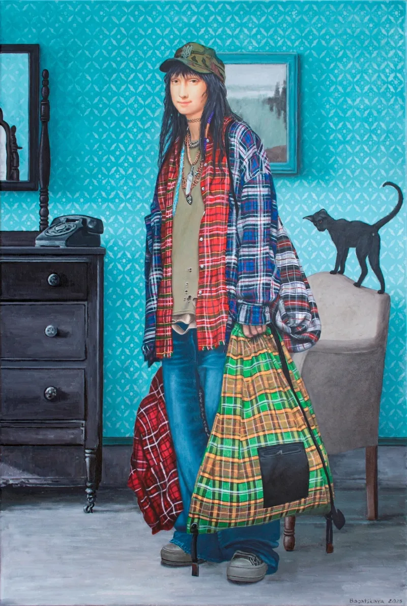
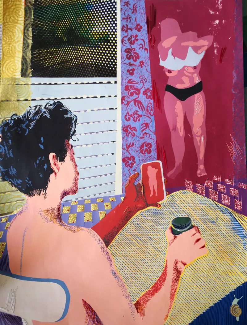
In expressionism, chaos is often so intense that it becomes a harmony of a peculiar kind. That intensity does not just come from technique or subject: it is implicit in the very palette itself. Expressionism wall art uses vibrant color as a tool of psychological storytelling. It is not there to make its viewers feel easy; it's there to make them feel something real.
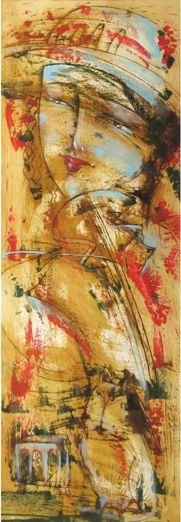
In the context of such art, bright colors often represent emotions like distress, despair, joy, or none at all. The combination of a burning pink and dull green can stand for emotional disharmony, and a screaming yellow hints at discord equally as much as vivacity. Color was not a counter-agent for artists like Ernst Ludwig Kirchner or Egon Schiele—it was where turbulence and perplexity were framed in solid form.
The "loudness" being visual isn't accidental. It's methodical, a way of sidestepping intellectual disengagement and grabbing hold on a fundamental level.
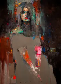
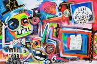
Color as Conflict: Emotional States in Paint
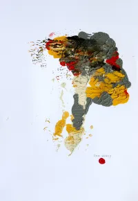
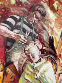
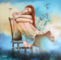
When they choose colors, Expressionist artists seldom do so simply for aesthetic reasons. They are also making an emotional statement. Painters like Edvard Munch used cold, unnatural tones to heighten that sense of alienation. Abstract expressionists like Willem de Kooning and Joan Mitchell pushed color to its emotional extremes. Thick strokes and busy hues pile up one over the other, for a portrait of storms the psyche can throw back out.
Unexpected and disharmonious color pairings are not a mistake, but a reflection of inner turmoil. Neon colors have little to do with modernity or current trends; they are often employed merely to reflect heightened emotions or moments of wrenching thought.
This kind of emotional rawness gives expressionist artwork its enduring attraction. It doesn’t ask you to look down from afar; instead, it presents something not yet sorted out--in both the art and perhaps within you.
Translating Into Space
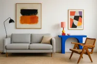
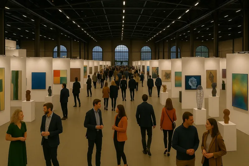
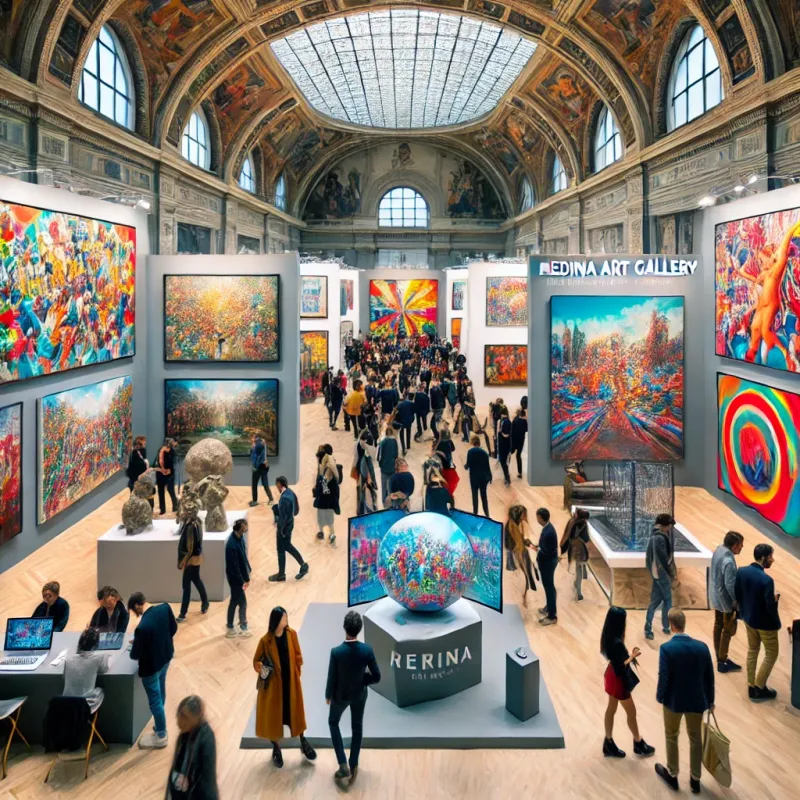
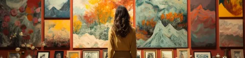
As expressionist works begin to enter modern interiors, their intensity collides somewhat with conventional decor. But that very dissonance is part of what makes them interesting. In a minimal setting, bright expressionism may be an anchor, a jolt of emotion in serene surroundings, or the bold centerpiece in any eclectic environment. Thus, for example, a vibrant expressionist painting can seize attention and become the focal point of a restrained living space.
Its visual language is not always "compatible" with the setting, and that's the point. These pieces' force doesn't come from how well they play off and incorporate themselves into the room's scheme, but from their ability to break off and grab your heart.
Designers comfortable with expressionist work appreciate that it brings life, feeling, and raw human energies into a room. It won't be walked over, nor should the space that houses it.
The Lasting Impact of Color-Driven Emotion
Communication is lively in a global age filled with pick-and-go aesthetics. In modern times, the ability to express oneself honestly is increasingly important. These works of art are not meant to be appreciated—they are meant to be experienced. And often, it is not the darkness but the brightness that holds the greatest unrest.
When you're collecting work for the walls of a living space or organizing an expressionism show in your gallery or house, remember this: color in expressionism is not decoration. It is a bright, buzzing declaration of the human experience—intense, emotional, and unmissable.