



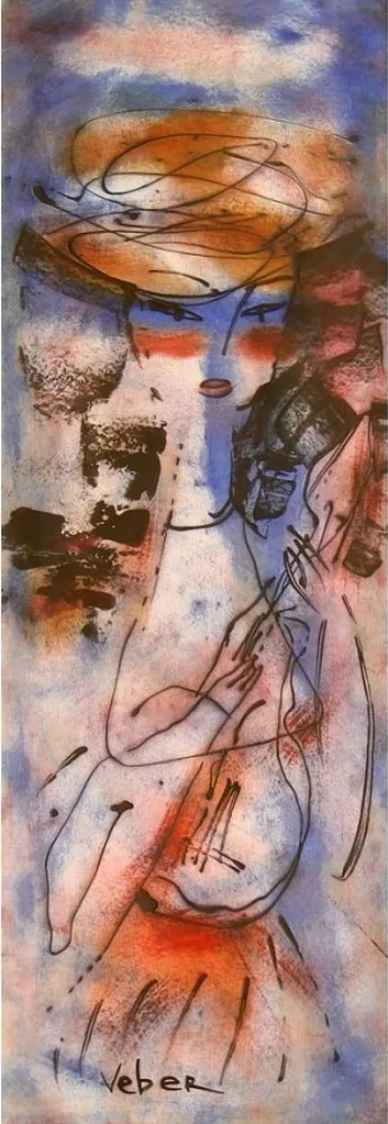


Original Collection Of Turquoise Color Paintings For Reception Area Decor
explore our collection of turquoise color palette paintings, ideal for enhancing your reception area decor. find the perfect piece to add elegance and vibrancy to your space.
- Coming Home
 Gill BustamanteUnited KingdomOil on Canvas101.6 X 101.6cm | 40 X 40in
£ 4,699 € 5,385 $6,350 Relevance
Score: 83%Matches: 2/2Reception Area Designation
The immediate appeal, welcoming tone, and polished, serene presence make it highly suitable for a reception area, creating a positive first impression.
Turquoise Color
The sea features prominent and defining turquoise and aqua-blue-green tones, contributing strongly to the palette's identity.
- Eleuthera Bahamas
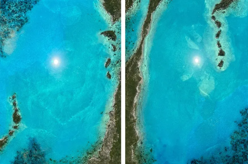 Ana HefcoUnited StatesMixed Technique182.88 X 121.92cm | 72 X 48in
£ 23,680 € 27,136 $32,000 Relevance
Score: 79%Matches: 2/2Turquoise Color
Turquoise is a defining and highly visible hue across most of the composition.
Reception Area Designation
Welcoming, polished, and easy to appreciate quickly, it makes a strong positive first-contact impression.
- After The Dark
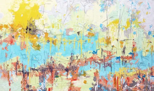 Dubi RonenIsraelMixed Technique200 X 120cm | 78.74 X 47.24in
£ 4,132 € 4,735 $5,583 Relevance
Score: 76%Matches: 2/2Turquoise Color
Turquoise is highly visible in the central horizontal band and repeated accents, making it a defining note.
Reception Area Designation
Welcoming brightness and polished large-scale abstraction create a strong first impression for visitors.
- Pleasant Moment
 Sima WeissIsraelOil on Canvas180 X 80cm | 70.87 X 31.5in
£ 1,166 € 1,336 $1,575 Relevance
Score: 76%Matches: 2/2Turquoise Color
Turquoise is exceptionally clear and dominant across large lower and side areas, defining the painting's palette identity.
Reception Area Designation
Welcoming yet polished abstraction makes a credible and attractive first impression.
- Abstract City
 Sima WeissIsraelOil on Canvas180 X 80cm | 70.87 X 31.5in
£ 1,133 € 1,298 $1,530 Relevance
Score: 76%Matches: 2/2Turquoise Color
Turquoise and aqua tones are highly visible and central to the painting's identity.
Reception Area Designation
Welcoming yet polished visual impact makes it suitable for a client-facing first-impression space.
- Renewable Energy
 Sima WeissIsraelOil on Canvas180 X 80cm | 70.87 X 31.5in
£ 1,022 € 1,171 $1,380 Relevance
Score: 75%Matches: 2/2Turquoise Color
Turquoise is one of the most striking and repeated hues in the central forms and reflections.
Reception Area Designation
Welcoming through color and highly presentable, with a polished contemporary look for first impressions.
- Jungle
 Akos Esse BankiHungaryOil on Canvas200 X 143cm | 78.74 X 56.3in
£ 8,425 € 9,654 $11,384 Relevance
Score: 73%Matches: 2/2Turquoise Color
Turquoise and aqua tones are highly visible across many major forms and are central to the palette.
Reception Area Designation
It creates a polished, memorable first impression and reads well publicly, though it is slightly intense for a purely welcoming tone.
- Green Peace (diptych)
 Irena BudagovIsraelAcrylic on Canvas120 X 90cm | 47.24 X 35.43in
£ 4,085 € 4,681 $5,520 Relevance
Score: 71%Matches: 2/2Turquoise Color
Turquoise and aqua-blue-green tones are among the most defining and widespread colors in the painting.
Reception Area Designation
Welcoming color, polished abstraction, and accessible elegance make it a credible fit for a guest-facing reception space.
- To Mend the Fractures
 Orly ShalemIsraelAcrylic on Canvas200 X 100cm | 78.74 X 39.37in
£ 3,552 € 4,071 $4,800 Relevance
Score: 68%Matches: 2/2Turquoise Color
Turquoise and aqua-blue-green tones are broadly visible and strongly shape the painting's identity.
Reception Area Designation
Welcoming color, polished abstraction, and large format make a credible first impression without feeling harsh.
- Under the Sun Umbrellas
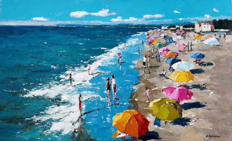 Olga EgorovIsraelOil on Canvas80 X 50cm | 31.5 X 19.69in
£ 962 € 1,103 $1,300 Relevance
Score: 68%Matches: 2/2Turquoise Color
The sea features prominent turquoise and aqua-blue-green tones, especially in the shallower water near the shore.
Reception Area Designation
The welcoming, accessible, and positive visual impression makes it suitable for a client-facing reception area.
- Magic People
 Irena BudagovIsraelAcrylic on Canvas120 X 80cm | 47.24 X 31.5in
£ 3,624 € 4,152 $4,896 Relevance
Score: 67%Matches: 2/2Turquoise Color
Turquoise accents in the earrings and headwrap are vivid and visually important.
Reception Area Designation
Welcoming yet distinctive, it offers a polished first impression for a guest-facing area.
- Pixels of Love
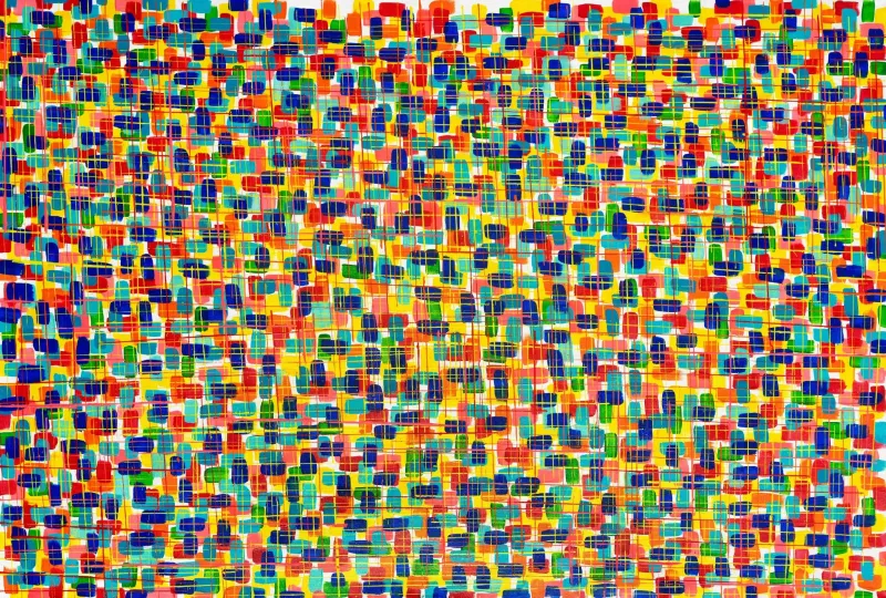 Sandra GrossIsraelAcrylic on Canvas200 X 100cm | 78.74 X 39.37in
£ 4,904 € 5,619 $6,626 Relevance
Score: 67%Matches: 2/2Turquoise Color
Turquoise is a clearly visible and repeated hue family across the painting.
Reception Area Designation
Welcoming brightness and strong contemporary presence make a memorable first impression in client-facing space.
- Harmony Of Koy
 Albert LeviIsraelAcrylic on Canvas90 X 120cm | 35.43 X 47.24in
£ 7,116 € 8,154 $9,615 Relevance
Score: 67%Matches: 2/2Turquoise Color
Turquoise and aqua tones are clearly visible throughout the blue background.
Reception Area Designation
Welcoming recognizable imagery and polished impact make it suitable for a guest-facing first-contact space.
- Tree Of Life - Colorful Dream
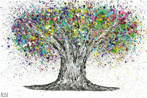 Albert LeviIsraelAcrylic on Canvas120 X 80cm | 47.24 X 31.5in
£ 7,116 € 8,154 $9,615 Relevance
Score: 67%Matches: 2/2Turquoise Color
Turquoise is highly visible in repeated canopy clusters and stands out as a defining accent family.
Reception Area Designation
Welcoming, accessible, and visually impressive without being confrontational, making a strong first-contact image.
- Through Nature
 Link ArtIsraelOil on Canvas130 X 100cm | 51.18 X 39.37in
£ 1,924 € 2,205 $2,600 Relevance
Score: 67%Matches: 2/2Turquoise Color
The large field reads strongly as turquoise/cyan-blue and is central to the painting's identity.
Reception Area Designation
Welcoming clarity, polish, and immediate visual appeal make it plausible for a reception setting.
- BEAT
 Annie KonfortyIsraelAcrylic on Canvas130 X 70cm | 51.18 X 27.56in
£ 2,960 € 3,392 $4,000 Relevance
Score: 67%Matches: 2/2Reception Area Designation
Welcoming brightness and polished abstraction make a credible, appealing first-contact image.
Turquoise Color
Turquoise and aqua tones are clearly visible and important in the reflections and atmospheric areas.
- Beautiful England
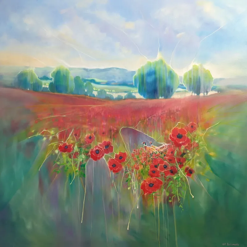 Gill BustamanteUnited KingdomOil on Canvas101.6 X 101.6cm | 40 X 40in
£ 4,699 € 5,385 $6,350 Relevance
Score: 65%Matches: 2/2Reception Area Designation
The welcoming tone, immediate appeal, and polished look make it suitable for a reception area, creating a positive first impression for visitors.
Turquoise Color
The trees and some distant landscape elements feature distinct aqua-blue-green tones, making turquoise a meaningful color presence.
- Scogli e onde
 Antonino PuliaficoItalyOil on Canvas133 X 94cm | 52.36 X 37.01in
£ 1,698 € 1,946 $2,294 Relevance
Score: 65%Matches: 2/2Turquoise Color
Turquoise and aqua notes are clearly visible in the water and contribute strongly to the coastal palette.
Reception Area Designation
Welcoming scenery, polished execution, and accessible beauty make it effective for a guest-facing first impression.
- Bodega Chic
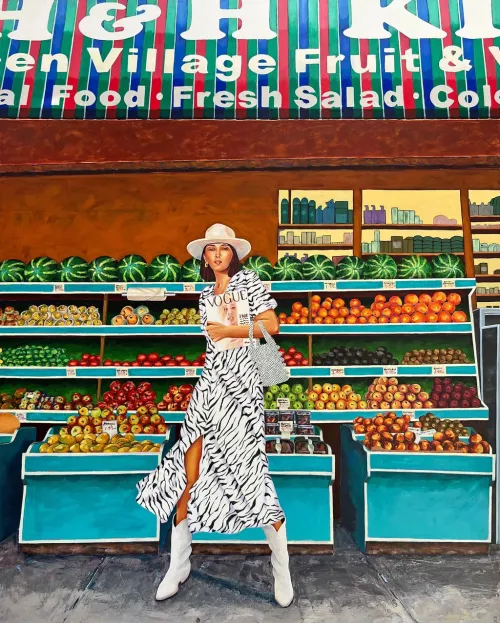 Marisa MacklinUnited StatesAcrylic on Canvas121.92 X 152.4cm | 48 X 60in
£ 8,880 € 10,176 $12,000 Relevance
Score: 65%Matches: 2/2Turquoise Color
Turquoise is a strong recurring note in the produce stands and parts of the upper sign, clearly shaping the palette.
Reception Area Designation
Welcoming, memorable, and polished with strong first-impression value in a client-facing space.
- Sweeps
 Orly ShalemIsraelAcrylic on Canvas200 X 100cm | 78.74 X 39.37in
£ 4,736 € 5,428 $6,400 Relevance
Score: 64%Matches: 2/2Reception Area Designation
Welcoming color, polished abstraction, and strong first-impression value make it plausible for a reception setting.
Turquoise Color
Turquoise and aqua-blue-green passages are clearly visible and important, though secondary to blue overall.
- Strike a pose
 Adaeze AdinnuUnited KingdomAcrylic on Canvas100 X 120cm | 39.37 X 47.24in
£ 10,516 € 12,051 $14,210 Relevance
Score: 63%Matches: 2/2Turquoise Color
Turquoise is clearly visible in several prominent clothing sections and helps define the figure's palette.
Reception Area Designation
Visually memorable, polished, and welcoming enough for a client-facing first impression.
- Bourgeois Bathers
 Tedoldi RobertoItalyOil on Canvas90 X 40cm | 35.43 X 15.75in
£ 2,524 € 2,892 $3,410 Relevance
Score: 62%Matches: 2/2Turquoise Color
Turquoise-green bands in the sea and plant accents are clearly visible and palette-shaping.
Reception Area Designation
Welcoming color, polished finish, and immediate visual charm make it a credible guest-facing piece.
- Polynesia
 Federico Pinto SchmidItalyOil on Canvas200 X 150cm | 78.74 X 59.06in
£ 10,685 € 12,245 $14,439 Relevance
Score: 62%Matches: 2/2Reception Area Designation
Welcoming color and polished large-scale abstraction create a credible, memorable first impression.
Turquoise Color
Turquoise and aqua-blue-green passages are clearly visible in repeated, meaningful areas.
- Anniesland Court
 Dylan BellUnited KingdomMixed Technique42 X 59cm | 16.54 X 23.23in
£ 178 € 204 $240 Relevance
Score: 62%Matches: 2/2Turquoise Color
The dominant blue field leans noticeably toward cyan-turquoise, making turquoise a meaningful part of the palette impression.
Reception Area Designation
Clean, contemporary, and accessible, it creates a credible and welcoming first-contact impression.
- La Vie Est Belle
 Laure BuryUnited KingdomMixed Technique100 X 80cm | 39.37 X 31.5in
£ 6,583 € 7,543 $8,895 Relevance
Score: 61%Matches: 2/2Reception Area Designation
Welcoming, accessible, and visually upbeat with a polished first-impression quality.
Turquoise Color
Turquoise is clearly visible on the hummingbirds and contributes strongly to the palette's identity.
Receive 10% on your first artwork
Once a month be the first to know about new trends, artworks and offers
