






Original Collection Of Contrasted Color Paintings For Reception Area Decor
explore our collection of contrasted color palette paintings, ideal for enhancing your reception area decor. find the perfect piece to add elegance and vibrancy to your space.
- SEAGULLS
 Tatiana RezvayaUnited KingdomOil on Canvas120 X 80cm | 47.24 X 31.5in
£ 4,115 € 4,715 $5,560 Relevance
Score: 65%Matches: 2/2Contrasted Color
Strong separation between deep ocean blues, pale sky, and bright white foam and birds gives clear contrast.
Reception Area Designation
Welcoming color, accessible subject matter, and polished execution make a positive first impression.
- Anniesland Court
 Dylan BellUnited KingdomMixed Technique42 X 59cm | 16.54 X 23.23in
£ 178 € 204 $240 Relevance
Score: 64%Matches: 2/2Contrasted Color
Strong separation between the flat blue field, white forms, and black architectural elements creates clear visual contrast.
Reception Area Designation
Clean, contemporary, and accessible, it creates a credible and welcoming first-contact impression.
- Merlinite
 Irena BudagovIsraelAcrylic on Canvas120 X 60cm | 47.24 X 23.62in
£ 2,984 € 3,420 $4,032 Relevance
Score: 63%Matches: 2/2Reception Area Designation
The painting is welcoming, polished, and immediately attractive, making it a credible fit for a guest-facing first-contact space.
Contrasted Color
The painting uses strong separation between white, grey, gold, and dark charcoal areas.
- Cityscape
 Olga EgorovIsraelOil on Canvas50 X 60cm | 19.69 X 23.62in
£ 696 € 798 $940 Relevance
Score: 62%Matches: 2/2Contrasted Color
Strong separation between bright whites, cool blues, greens, and dark trunks gives clear visual contrast.
Reception Area Designation
Welcoming, polished, and easy to appreciate quickly, it would make a positive first-contact impression.
- Riflessi Dorati su San Marco
 Antonino PuliaficoItalyOil on Canvas140 X 160cm | 55.12 X 62.99in
£ 2,778 € 3,184 $3,754 Relevance
Score: 62%Matches: 2/2Reception Area Designation
Welcoming elegance and immediate visual appeal make it suitable for a polished client-facing entrance area.
Contrasted Color
Strong light-dark and cool-warm separations give the palette clear visual definition.
- Strike a pose
 Adaeze AdinnuUnited KingdomAcrylic on Canvas100 X 120cm | 39.37 X 47.24in
£ 10,516 € 12,051 $14,210 Relevance
Score: 62%Matches: 2/2Contrasted Color
There is strong separation between pale background, dark figure accents, and distinct color blocks in the clothing.
Reception Area Designation
Visually memorable, polished, and welcoming enough for a client-facing first impression.
- Waterscape
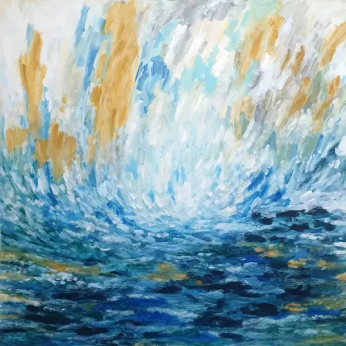 Orly ShalemIsraelAcrylic on Canvas140 X 140cm | 55.12 X 55.12in
£ 3,157 € 3,617 $4,265 Relevance
Score: 62%Matches: 2/2Contrasted Color
Strong separation between bright whites, pale blues, and darker blue depths gives the palette clear contrast.
Reception Area Designation
Welcoming color, polished abstraction, and strong first-impression value make it suitable for a client-facing area.
Receive 10% on your first artwork
Once a month be the first to know about new trends, artworks and offers
