





Original Collection Of Orange Color Paintings For Reception Area Decor
explore our collection of orange color palette paintings, ideal for enhancing your reception area decor. find the perfect piece to add elegance and vibrancy to your space.
- Autumn Beckons
 Gill BustamanteUnited KingdomOil on Canvas91.44 X 91.44cm | 36 X 36in
£ 4,115 € 4,715 $5,560 Relevance
Score: 85%Matches: 2/2Reception Area Designation
Its welcoming warmth, professional polish, and positive visual impression make it ideal for a client-facing or guest-facing area.
Orange Color
Orange is a very prominent hue, radiating outwards from the central yellow light and dominating large warm areas of the painting.
- Sky
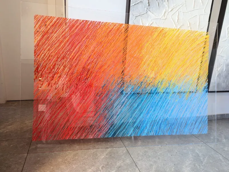 Sandra GrossIsraelAcrylic on Plexiglass180 X 110cm | 70.87 X 43.31in
£ 5,426 € 6,218 $7,332 Relevance
Score: 73%Matches: 2/2Orange Color
Orange is one of the most dominant visible hues, spanning much of the upper and left portions.
Reception Area Designation
Welcoming brightness and polished modern presence make a credible, memorable first-contact statement.
- La Vie Est Belle
 Laure BuryUnited KingdomMixed Technique100 X 80cm | 39.37 X 31.5in
£ 6,583 € 7,543 $8,895 Relevance
Score: 72%Matches: 2/2Orange Color
Orange-gold dominates the entire background and strongly defines the painting's color identity.
Reception Area Designation
Welcoming, accessible, and visually upbeat with a polished first-impression quality.
- Falling Sky
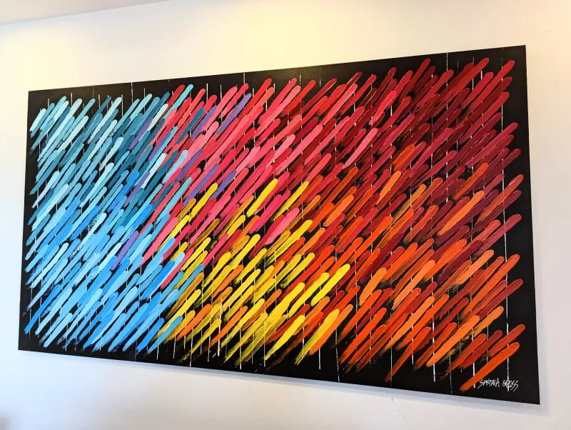 Sandra GrossIsraelAcrylic on Canvas150 X 100cm | 59.06 X 39.37in
£ 4,623 € 5,297 $6,246 Relevance
Score: 68%Matches: 2/2Orange Color
Orange is strongly visible across the lower-right and central-right areas.
Reception Area Designation
Welcoming through color and visually memorable, with enough polish for guest-facing display.
- A Day in December
 Gill BustamanteUnited KingdomOil on Canvas101.6 X 101.6cm | 40 X 40in
£ 4,699 € 5,385 $6,350 Relevance
Score: 68%Matches: 2/2Reception Area Designation
The welcoming tone, polished appearance, and pleasant visual appeal make a positive first impression for a client-facing reception area.
Orange Color
Orange is a clearly defining hue in the pheasant's plumage and is also present in the luminous background foliage, contributing significant warmth.
- Under the Sun Umbrellas
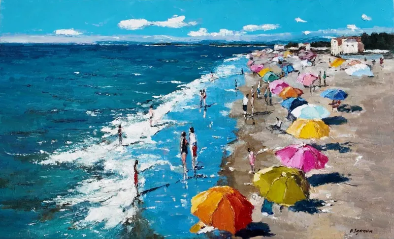 Olga EgorovIsraelOil on Canvas80 X 50cm | 31.5 X 19.69in
£ 962 € 1,103 $1,300 Relevance
Score: 68%Matches: 2/2Orange Color
Prominent orange umbrellas are a significant and eye-catching feature, contributing strong warmth and contrast.
Reception Area Designation
The welcoming, accessible, and positive visual impression makes it suitable for a client-facing reception area.
- Bodega Chic
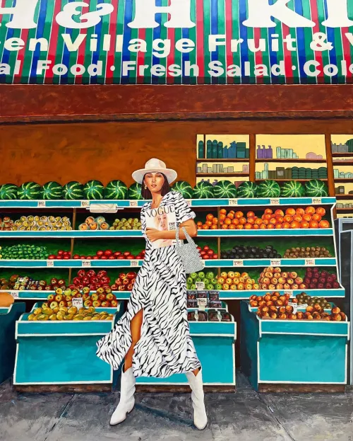 Marisa MacklinUnited StatesAcrylic on Canvas121.92 X 152.4cm | 48 X 60in
£ 8,880 € 10,176 $12,000 Relevance
Score: 68%Matches: 2/2Orange Color
Orange fruit occupies broad, repeated areas and strongly shapes the warm visual identity of the scene.
Reception Area Designation
Welcoming, memorable, and polished with strong first-impression value in a client-facing space.
- Unveiling Happiness
 Kehinde Wasiu OlamilekanNigeriaAcrylic on Canvas60.96 X 91.44cm | 24 X 36in
£ 518 € 594 $700 Relevance
Score: 66%Matches: 2/2Orange Color
The orange gift box is large, central, and strongly influences the palette impression.
Reception Area Designation
Welcoming expression, polished presentation, and immediate visual appeal make it a strong fit for a guest-facing area.
- Magic People
 Irena BudagovIsraelAcrylic on Canvas120 X 80cm | 47.24 X 31.5in
£ 3,624 € 4,152 $4,896 Relevance
Score: 65%Matches: 2/2Orange Color
Orange is clearly visible and repeated in the headwrap and jewelry, shaping the warm palette identity.
Reception Area Designation
Welcoming yet distinctive, it offers a polished first impression for a guest-facing area.
- Venetian Impressions
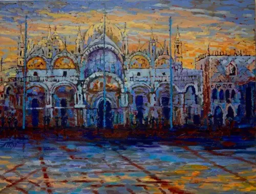 Natalia WustSwitzerlandOil on Canvas130 X 110cm | 51.18 X 43.31in
£ 4,682 € 5,365 $6,326 Relevance
Score: 65%Matches: 2/2Orange Color
Orange is a major visible hue in the sunset sky, window glows, and reflected ground accents.
Reception Area Designation
The painting is welcoming, polished, and impressive enough to create a strong first-contact impression.
- Pixels of Love
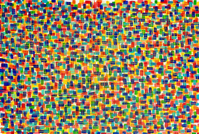 Sandra GrossIsraelAcrylic on Canvas200 X 100cm | 78.74 X 39.37in
£ 4,904 € 5,619 $6,626 Relevance
Score: 65%Matches: 2/2Reception Area Designation
Welcoming brightness and strong contemporary presence make a memorable first impression in client-facing space.
Orange Color
Orange is repeatedly visible in many marks and contributes strongly to the warm palette identity.
- Kaleidoscope
 Montse Barberà PujolSpainAcrylic on Canvas120 X 60cm | 47.24 X 23.62in
£ 3,914 € 4,486 $5,289 Relevance
Score: 64%Matches: 2/2Orange Color
Orange occupies several broad shards and strongly contributes to the painting's warm identity.
Reception Area Designation
Welcoming through color and memorable at first glance, with enough polish for a guest-facing area.
Receive 10% on your first artwork
Once a month be the first to know about new trends, artworks and offers
