





Original Collection Of Complementary Color Paintings For Outdoor Area Decor
explore our collection of complementary color palette paintings, ideal for enhancing your outdoor area decor. find the perfect piece to add elegance and vibrancy to your space.
- Under the Sun Umbrellas
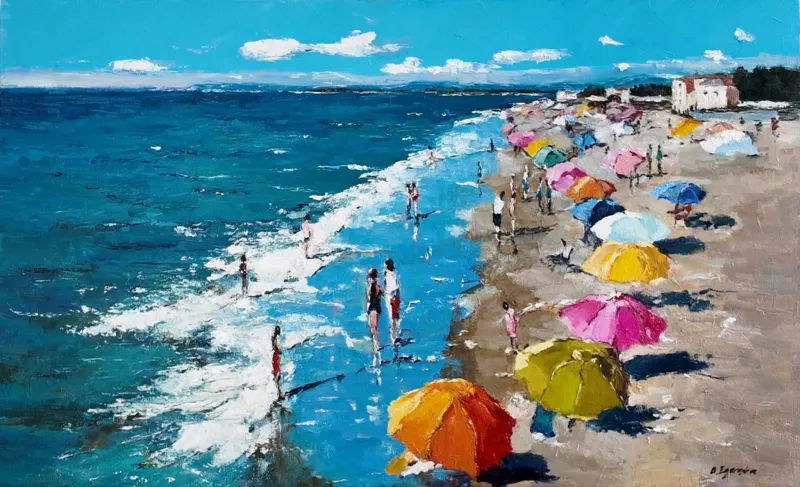 Olga EgorovIsraelOil on Canvas80 X 50cm | 31.5 X 19.69in
£ 962 € 1,103 $1,300 Relevance
Score: 83%Matches: 2/2Outdoor Area Designation
The open, fresh, and nature-compatible beach scene is an excellent fit for an exterior or open-air setting.
Complementary Color
There is a clear and effective complementary relationship between the dominant blues of the sea/sky and the vibrant orange/yellow umbrellas.
- Free Reading
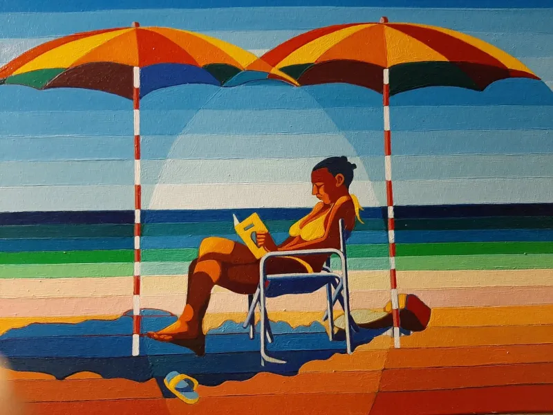 Tedoldi RobertoItalyOil on Canvas50 X 35cm | 19.69 X 13.78in
£ 1,096 € 1,256 $1,480 Relevance
Score: 69%Matches: 2/2Outdoor Area Designation
Open-air beach imagery and fresh bright atmosphere feel naturally compatible with exterior-adjacent placement.
Complementary Color
Blue and orange/yellow are strongly opposed across major areas, creating clear complementary energy.
- Street
 Olga EgorovIsraelOil on Canvas60 X 80cm | 23.62 X 31.5in
£ 1,480 € 1,696 $2,000 Relevance
Score: 68%Matches: 2/2Complementary Color
Strong pink-red flowers against abundant green foliage create a clear complementary relationship.
Outdoor Area Designation
The open-air garden feeling, bright light, and natural freshness translate well to an exterior-adjacent setting.
- Memories of the Crimea
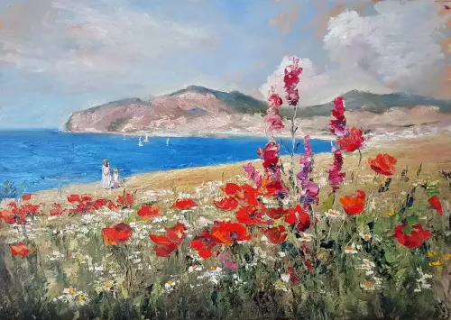 Olga EgorovIsraelOil on Canvas1000 X 70cm | 393.7 X 27.56in
£ 1,480 € 1,696 $2,000 Relevance
Score: 66%Matches: 2/2Complementary Color
Strong blue sea and sky are energized by vivid red-orange flowers in a clear complementary relationship.
Outdoor Area Designation
The breezy coastal landscape and natural floral energy feel compatible with open-air or garden-adjacent environments.
- Incoming Tide
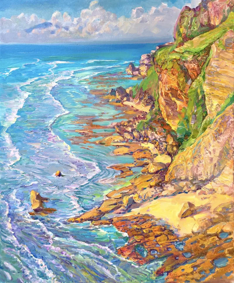 Aleksandr DubrovskyyOil on Canvas50 X 60cm | 19.69 X 23.62in
£ 7,637 € 8,752 $10,320 Relevance
Score: 65%Matches: 2/2Outdoor Area Designation
Open-air freshness, natural subject matter, and resilient sunny mood fit an exterior-adjacent setting well.
Complementary Color
Blue water and sky are energized by orange-gold cliff and shore passages in a clear blue-orange opposition.
- Summer Harbingers
 Gill BustamanteUnited KingdomOil on Canvas101.6 X 101.6cm | 40 X 40in
£ 4,699 € 5,385 $6,350 Relevance
Score: 65%Matches: 2/2Complementary Color
Red flowers play strongly against the dominant green field, creating a clear red-green complementary structure.
Outdoor Area Designation
Open, nature-compatible energy and fresh color make it suitable for an exterior-adjacent or garden-facing setting.
- Floating Through The Venice
 Katrina AvotinaUnited KingdomAcrylic on Canvas25.5 X 25.5cm | 10.04 X 10.04in
£ 500 € 573 $675 Relevance
Score: 64%Matches: 2/2Outdoor Area Designation
Open-air feeling, water setting, and fresh bright palette make it naturally compatible with exterior-adjacent display.
Complementary Color
Blue-cyan areas are energized by orange-yellow and pink accents, creating noticeable opposing color relationships.
- Coastal Cliffside View
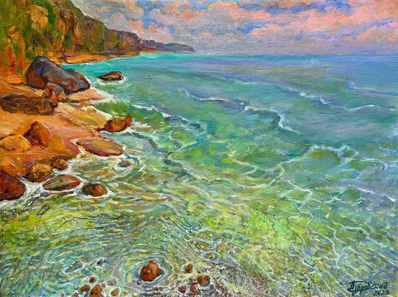 Aleksandr DubrovskyyOil on Canvas40 X 30cm | 15.75 X 11.81in
£ 814 € 933 $1,100 Relevance
Score: 63%Matches: 2/2Outdoor Area Designation
Its open-air coastal freshness and nature-compatible palette make it plausible for an outdoor-adjacent setting.
Complementary Color
Cool blue-green water is energized by orange-brown shore and rock notes in a clear opposing relationship.
Receive 10% on your first artwork
Once a month be the first to know about new trends, artworks and offers
