






Original Collection Of Complementary Color Paintings For Reception Area Decor
explore our collection of complementary color palette paintings, ideal for enhancing your reception area decor. find the perfect piece to add elegance and vibrancy to your space.
- Beautiful England
 Gill BustamanteUnited KingdomOil on Canvas101.6 X 101.6cm | 40 X 40in
£ 4,699 € 5,385 $6,350 Relevance
Score: 75%Matches: 2/2Complementary Color
There is a strong and clear complementary relationship between the dominant red field and the prominent green and blue tones in the foliage and sky.
Reception Area Designation
The welcoming tone, immediate appeal, and polished look make it suitable for a reception area, creating a positive first impression for visitors.
- Autumn Beckons
 Gill BustamanteUnited KingdomOil on Canvas91.44 X 91.44cm | 36 X 36in
£ 4,115 € 4,715 $5,560 Relevance
Score: 75%Matches: 2/2Reception Area Designation
Its welcoming warmth, professional polish, and positive visual impression make it ideal for a client-facing or guest-facing area.
Complementary Color
There is a clear and meaningful contrast between the dominant warm yellows/oranges in the center and the cooler blues/purples on the periphery.
- Renewable Energy
 Sima WeissIsraelOil on Canvas180 X 80cm | 70.87 X 31.5in
£ 1,022 € 1,171 $1,380 Relevance
Score: 73%Matches: 2/2Reception Area Designation
Welcoming through color and highly presentable, with a polished contemporary look for first impressions.
Complementary Color
Blue-turquoise areas are strongly opposed by orange accents, shaping the palette energy.
- A Day in December
 Gill BustamanteUnited KingdomOil on Canvas101.6 X 101.6cm | 40 X 40in
£ 4,699 € 5,385 $6,350 Relevance
Score: 73%Matches: 2/2Reception Area Designation
The welcoming tone, polished appearance, and pleasant visual appeal make a positive first impression for a client-facing reception area.
Complementary Color
There is a strong and intentional contrast between the dominant cool blues/purples and the warm yellows/oranges/pinks in the background and on the pheasant.
- Bright Day
 Irena BudagovIsraelAcrylic on Canvas120 X 90cm | 47.24 X 35.43in
£ 3,730 € 4,274 $5,040 Relevance
Score: 71%Matches: 2/2Complementary Color
The strong blue-versus-yellow opposition is a major visible palette relationship.
Reception Area Designation
Welcoming brightness and polished impact make it suitable for a guest-facing first impression.
- Red Sails (diptych)
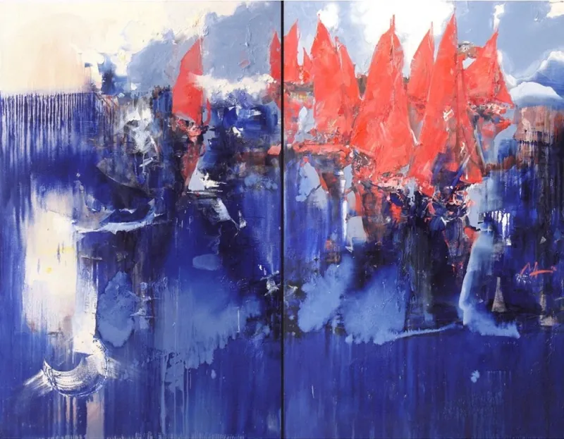 Alyna MaksymenkoCzech RepublicOil on Canvas180 X 140cm | 70.87 X 55.12in
£ 7,569 € 8,674 $10,228 Relevance
Score: 71%Matches: 2/2Complementary Color
The strong opposition between blue fields and orange-red sails drives the palette impact.
Reception Area Designation
Welcoming enough through color and polish, with strong first-contact presence suitable for client-facing spaces.
- Under the Sun Umbrellas
 Olga EgorovIsraelOil on Canvas80 X 50cm | 31.5 X 19.69in
£ 962 € 1,103 $1,300 Relevance
Score: 70%Matches: 2/2Complementary Color
There is a clear and effective complementary relationship between the dominant blues of the sea/sky and the vibrant orange/yellow umbrellas.
Reception Area Designation
The welcoming, accessible, and positive visual impression makes it suitable for a client-facing reception area.
- Pixels of Love
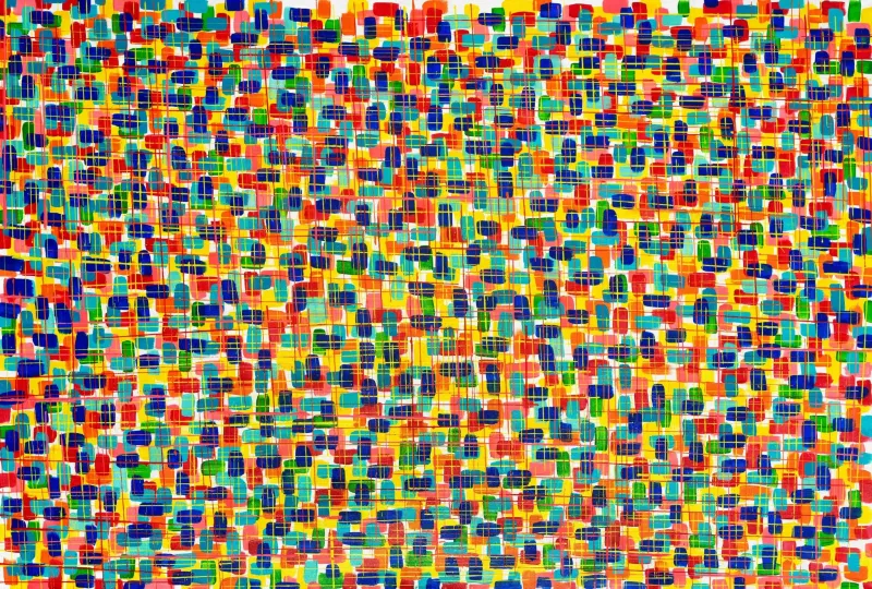 Sandra GrossIsraelAcrylic on Canvas200 X 100cm | 78.74 X 39.37in
£ 4,904 € 5,619 $6,626 Relevance
Score: 70%Matches: 2/2Complementary Color
Blue-orange/yellow and red-green oppositions are repeatedly visible and energize the palette.
Reception Area Designation
Welcoming brightness and strong contemporary presence make a memorable first impression in client-facing space.
- In a red dress
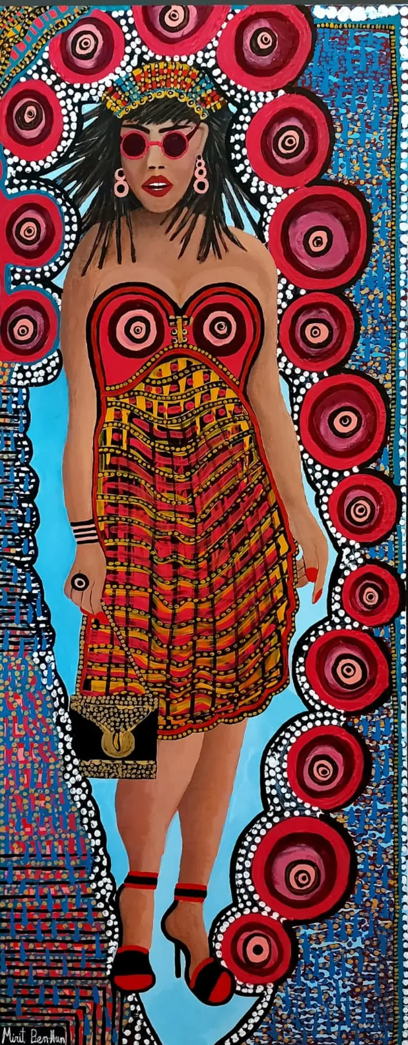 Mirit Ben NunIsraelAcrylic on Canvas50 X 160cm | 19.69 X 62.99in
£ 5,772 € 6,615 $7,800 Relevance
Score: 69%Matches: 2/2Complementary Color
Blue against orange-red and yellow-orange creates a strong complementary palette structure.
Reception Area Designation
It is welcoming in a stylish public-facing way and creates memorable first-contact impact without being obscure.
- Sky
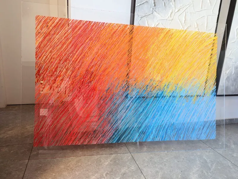 Sandra GrossIsraelAcrylic on Plexiglass180 X 110cm | 70.87 X 43.31in
£ 5,426 € 6,218 $7,332 Relevance
Score: 69%Matches: 2/2Complementary Color
The warm orange-yellow field is set against a substantial blue area, creating a strong blue-orange complementary structure.
Reception Area Designation
Welcoming brightness and polished modern presence make a credible, memorable first-contact statement.
- After The Dark
 Dubi RonenIsraelMixed Technique200 X 120cm | 78.74 X 47.24in
£ 4,132 € 4,735 $5,583 Relevance
Score: 69%Matches: 2/2Reception Area Designation
Welcoming brightness and polished large-scale abstraction create a strong first impression for visitors.
Complementary Color
Blue-turquoise areas are energized by orange-coral and yellow-orange accents in meaningful opposition.
- Venetian Impressions
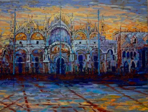 Natalia WustSwitzerlandOil on Canvas130 X 110cm | 51.18 X 43.31in
£ 4,682 € 5,365 $6,326 Relevance
Score: 69%Matches: 2/2Complementary Color
The palette is strongly energized by blue versus orange-yellow opposition across sky, architecture, and reflections.
Reception Area Designation
The painting is welcoming, polished, and impressive enough to create a strong first-contact impression.
- Memories of the Crimea
 Olga EgorovIsraelOil on Canvas1000 X 70cm | 393.7 X 27.56in
£ 1,480 € 1,696 $2,000 Relevance
Score: 69%Matches: 2/2Complementary Color
Strong blue sea and sky are energized by vivid red-orange flowers in a clear complementary relationship.
Reception Area Designation
Welcoming, accessible beauty and large-format presence make it effective for a guest-facing first-contact space.
- Unveiling Happiness
 Kehinde Wasiu OlamilekanNigeriaAcrylic on Canvas60.96 X 91.44cm | 24 X 36in
£ 518 € 594 $700 Relevance
Score: 68%Matches: 2/2Complementary Color
The strong opposition between the pink/orange warms and the blue garment clearly structures the palette.
Reception Area Designation
Welcoming expression, polished presentation, and immediate visual appeal make it a strong fit for a guest-facing area.
- Plaza de Espana - Sevilla
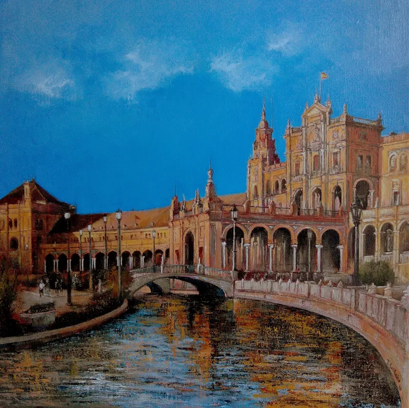 Tomas CastanoSpainOil on Canvas50 X 50cm | 19.69 X 19.69in
£ 5,069 € 5,809 $6,850 Relevance
Score: 68%Matches: 2/2Complementary Color
The strong blue sky and warm orange-ochre buildings create a clear blue-orange complementary structure.
Reception Area Designation
Welcoming, polished, and immediately legible, with elegant architecture that creates a credible first-contact impression.
- Gucci Gucci Goo 2
 Marisa MacklinUnited StatesAcrylic on Canvas91.44 X 91.44cm | 36 X 36in
£ 3,700 € 4,240 $5,000 Relevance
Score: 68%Matches: 2/2Complementary Color
The strong opposition between saturated yellow and deep blue is a major structural color relationship.
Reception Area Designation
It is welcoming enough while projecting polish, confidence, and memorable contemporary style for first-contact spaces.
- Falling Sky
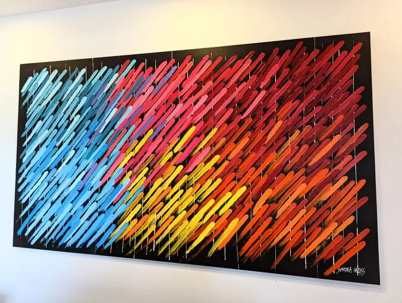 Sandra GrossIsraelAcrylic on Canvas150 X 100cm | 59.06 X 39.37in
£ 4,623 € 5,297 $6,246 Relevance
Score: 67%Matches: 2/2Complementary Color
Blue areas oppose orange-red zones prominently across the painting.
Reception Area Designation
Welcoming through color and visually memorable, with enough polish for guest-facing display.
- Red Sails
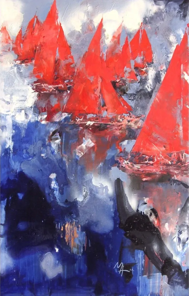 Alyna MaksymenkoCzech RepublicOil on Canvas90 X 140cm | 35.43 X 55.12in
£ 3,862 € 4,425 $5,218 Relevance
Score: 67%Matches: 2/2Complementary Color
The strong opposition between vivid red sails and blue water creates a clear complementary structure.
Reception Area Designation
It is welcoming through color and memorable on first glance, with enough polish for guest-facing display.
- Bridges
 Annie KonfortyIsraelAcrylic on Canvas120 X 90cm | 47.24 X 35.43in
£ 2,664 € 3,053 $3,600 Relevance
Score: 65%Matches: 2/2Complementary Color
Blue-dominant areas are repeatedly energized by orange-red accents, creating a clear complementary structure.
Reception Area Designation
Welcoming color, polished abstraction, and strong first-glance appeal suit a client-facing entry zone.
- Strike
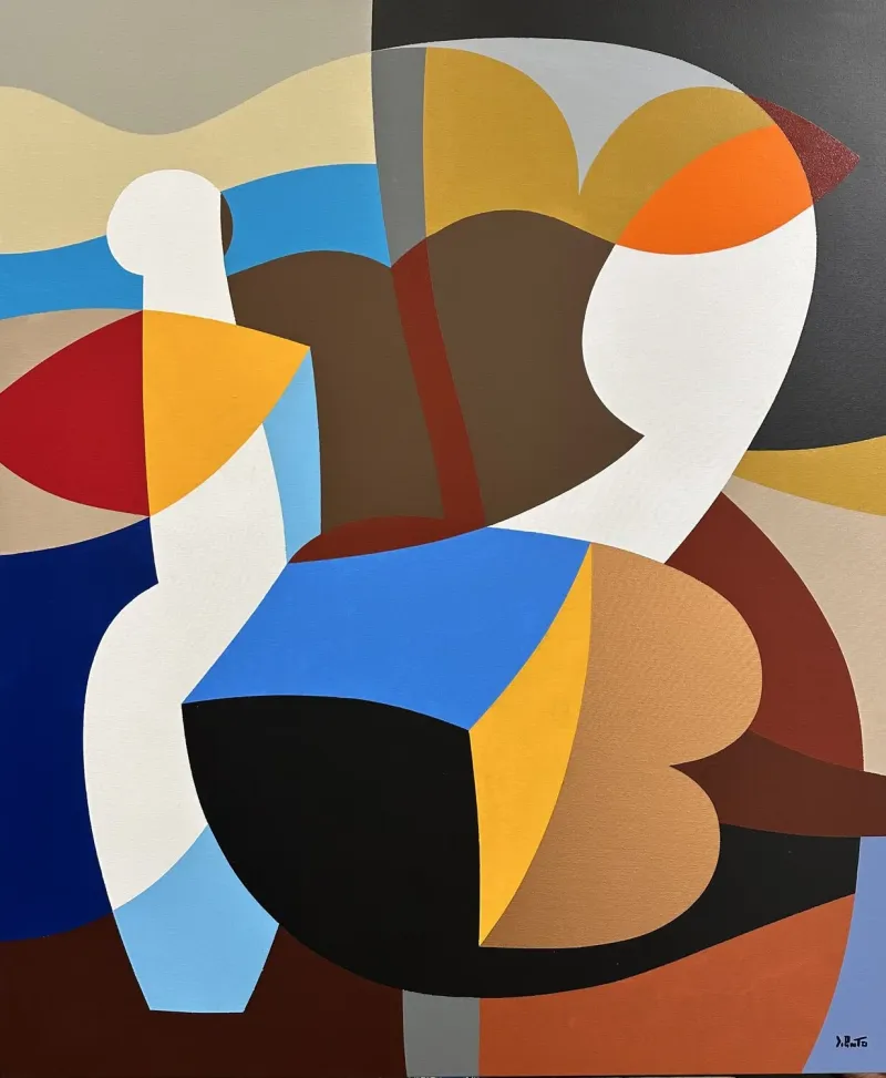 Federico Pinto SchmidItalyAcrylic on Canvas100 X 120cm | 39.37 X 47.24in
£ 6,717 € 7,697 $9,076 Relevance
Score: 65%Matches: 2/2Complementary Color
Blue-orange and blue-yellow oppositions are prominent and help drive the palette's visual energy.
Reception Area Designation
It is welcoming enough, visually polished, and memorable without being confrontational, fitting a client-facing entry zone.
- La Vie Est Belle
 Laure BuryUnited KingdomMixed Technique100 X 80cm | 39.37 X 31.5in
£ 6,583 € 7,543 $8,895 Relevance
Score: 65%Matches: 2/2Complementary Color
The dominant warm orange ground is strongly opposed by cool blue-violet and turquoise accents.
Reception Area Designation
Welcoming, accessible, and visually upbeat with a polished first-impression quality.
- Regatta
 Paul KaminskiCzech RepublicOil on Canvas120 X 80cm | 47.24 X 31.5in
£ 3,169 € 3,632 $4,282 Relevance
Score: 63%Matches: 2/2Reception Area Designation
Welcoming brightness and polished abstract style make a credible, appealing first-contact impression.
Complementary Color
The strong red form against green-yellow and blue surroundings creates a meaningful complementary tension.
- Ali al crepuscolo
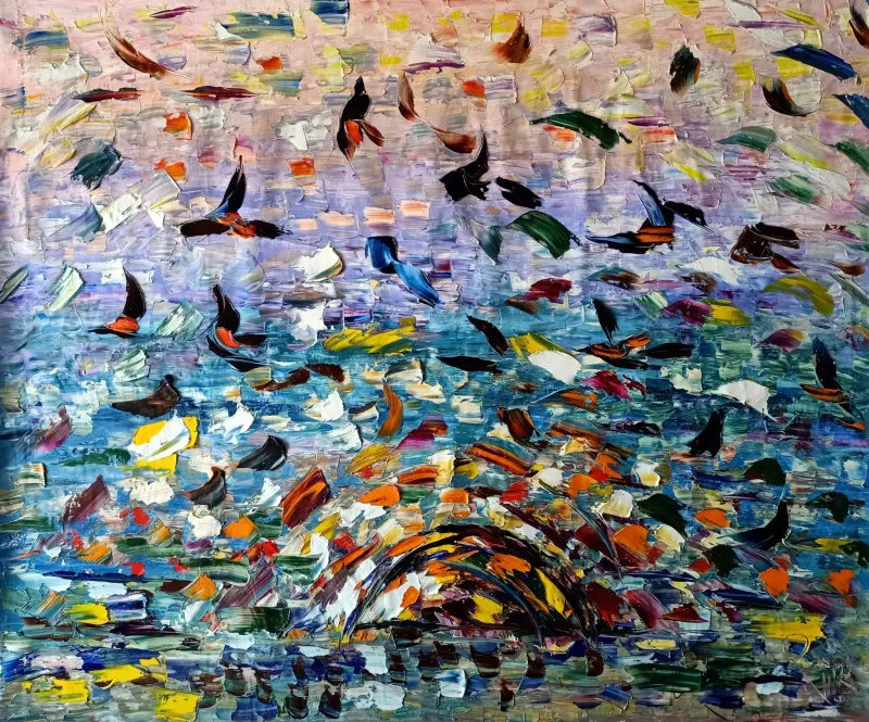 Antonino PuliaficoItalyOil on Canvas150 X 120cm | 59.06 X 47.24in
£ 2,316 € 2,654 $3,129 Relevance
Score: 63%Matches: 2/2Reception Area Designation
Welcoming color and strong first-glance appeal make it suitable for a polished guest-facing area.
Complementary Color
Blue fields are energized by orange accents and some yellow-violet interplay, creating meaningful opposing relationships.
- Tree Of Life - Colorful Dream
 Albert LeviIsraelAcrylic on Canvas120 X 80cm | 47.24 X 31.5in
£ 7,116 € 8,154 $9,615 Relevance
Score: 62%Matches: 2/2Reception Area Designation
Welcoming, accessible, and visually impressive without being confrontational, making a strong first-contact image.
Complementary Color
Strong oppositions such as red-green and blue-yellow are visibly active across the composition.
- Kaleidoscope
 Montse Barberà PujolSpainAcrylic on Canvas120 X 60cm | 47.24 X 23.62in
£ 3,914 € 4,486 $5,289 Relevance
Score: 62%Matches: 2/2Complementary Color
Warm reds-oranges-pinks are repeatedly set against green and blue-green areas, creating meaningful opposing color tension.
Reception Area Designation
Welcoming through color and memorable at first glance, with enough polish for a guest-facing area.
- Bodega Chic
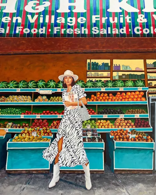 Marisa MacklinUnited StatesAcrylic on Canvas121.92 X 152.4cm | 48 X 60in
£ 8,880 € 10,176 $12,000 Relevance
Score: 62%Matches: 2/2Complementary Color
Blue-turquoise structures oppose orange fruit prominently, creating a clear complementary effect across the scene.
Reception Area Designation
Welcoming, memorable, and polished with strong first-impression value in a client-facing space.
- Waterscape
 Orly ShalemIsraelAcrylic on Canvas140 X 140cm | 55.12 X 55.12in
£ 3,157 € 3,617 $4,265 Relevance
Score: 61%Matches: 2/2Reception Area Designation
Welcoming color, polished abstraction, and strong first-impression value make it suitable for a client-facing area.
Complementary Color
Blue fields are energized by recurring orange-gold accents, creating a clear blue-orange opposition.
- Summer Inspiration
 Olga EgorovIsraelOil on Canvas60 X 60cm | 23.62 X 23.62in
£ 726 € 832 $980 Relevance
Score: 61%Matches: 2/2Complementary Color
Cool blues are energized by yellow-green foliage and small orange flower accents, giving clear opposition.
Reception Area Designation
Welcoming, polished, and accessible, with a positive first-contact feel that suits guest-facing spaces well.
Receive 10% on your first artwork
Once a month be the first to know about new trends, artworks and offers
