

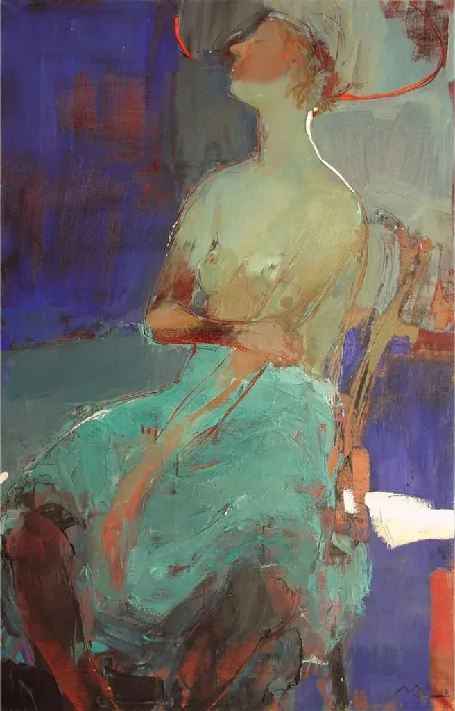
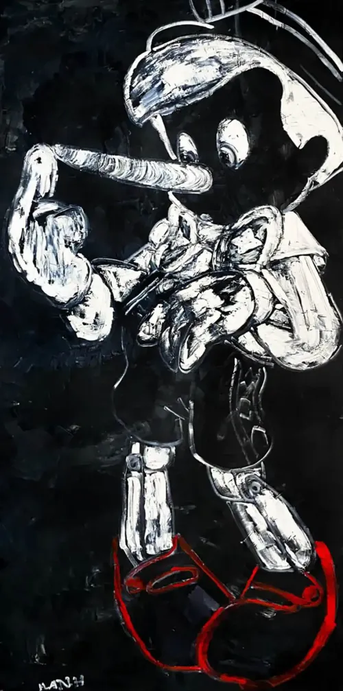
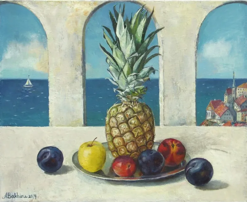

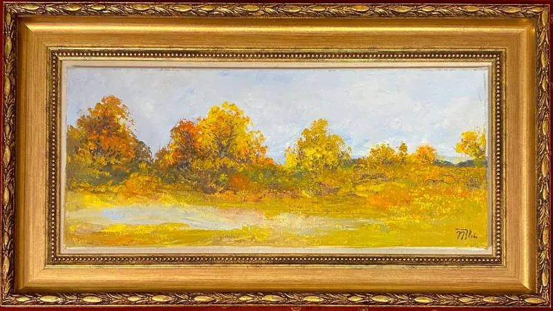
Original Tertiary Color, Post-Impressionism Wall Art Collection
transform any space with captivating tertiary color palette, post-impressionism styled paintings. shop our collection to find the perfect piece to create a serene and soothing ambiance.
- Quiet harbor
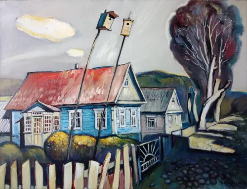 Anatoli LabkouskiGermanyOil on Linen80 X 60cm | 31.5 X 23.62in
£ 1,336 € 1,531 $1,805 Relevance
Score: 64%Matches: 2/2Post-Impressionism Style
Painterly surface, strong structural simplification, and expressive color organization align well with post-impressionist stylization.
Tertiary Color
Many colors are mixed intermediate hues—blue-greys, olive greens, muted violets, and dusty reds.
- Fortune
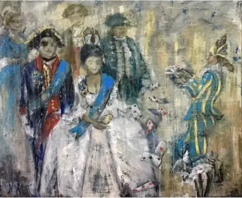 Natalia WustSwitzerlandOil on Canvas120 X 100cm | 47.24 X 39.37in
£ 3,678 € 4,215 $4,970 Relevance
Score: 63%Matches: 2/2Post-Impressionism Style
Loose painterly handling is combined with stronger stylization, decorative structure, and expressive simplification beyond pure impressionistic observation.
Tertiary Color
Many colors are mixed, in-between hues such as greyed blue-greens, beige, and muted earth tones.
- Sunrise Over Jerusalem Mountains
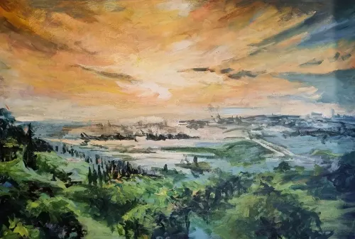 Ora UzielIsraelOil on Canvas120 X 80cm | 47.24 X 31.5in
£ 5,920 € 6,784 $8,000 Relevance
Score: 63%Matches: 2/2Tertiary Color
The palette includes many mixed intermediate hues such as olive greens, ochres, blue-greys, and softened orange-beiges.
Post-Impressionism Style
The work combines impressionistic looseness with stronger color shaping and structural stylization across the landscape.
- Motherhood
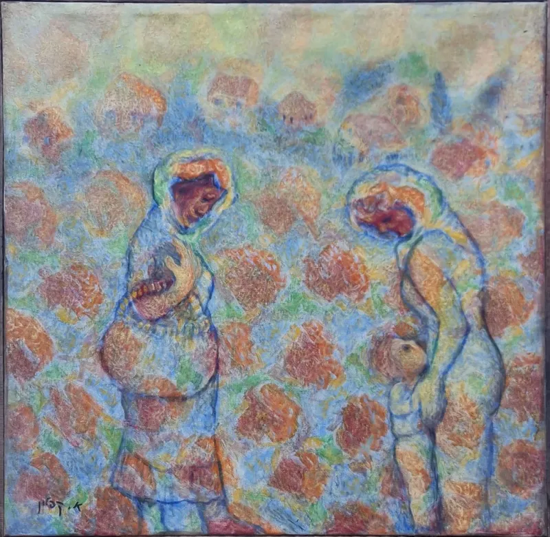 Arie KaplanIsraelOil on Canvas60 X 60cm | 23.62 X 23.62in
£ 2,664 € 3,053 $3,600 Relevance
Score: 62%Matches: 2/2Tertiary Color
Many hues are mixed intermediate tones—peach, blue-green, dusty orange, and muted mauves rather than pure primaries.
Post-Impressionism Style
The painting combines impressionistic surface softness with stronger stylization, structure, and expressive color organization.
- Spring Flowers
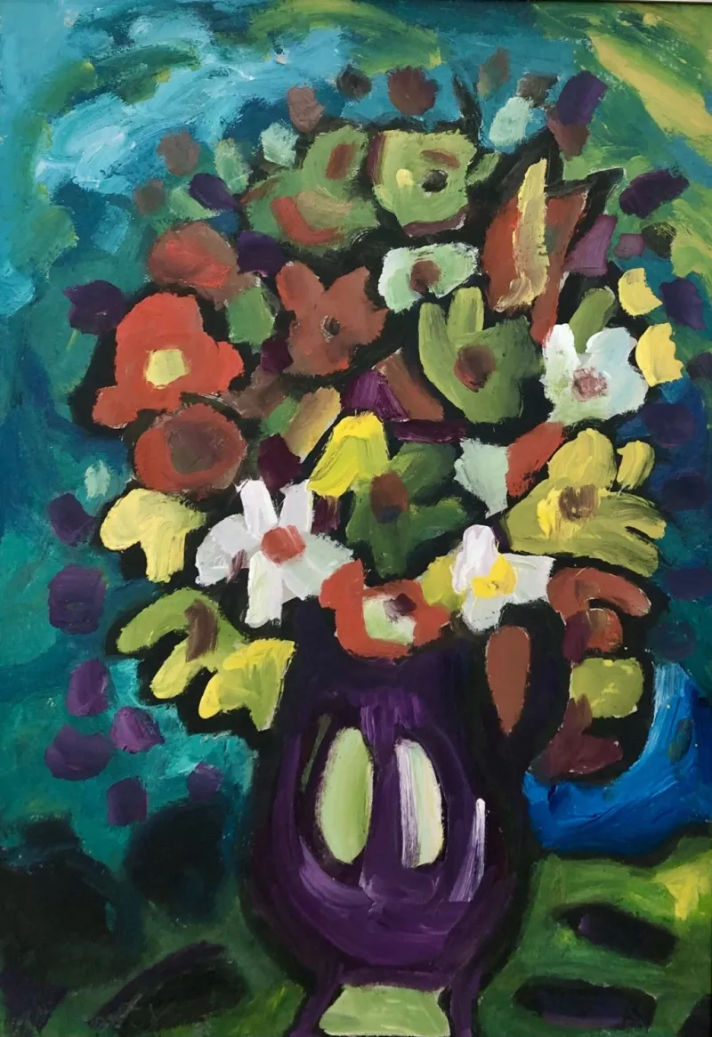 Miklos NemethHungaryOil on Cardboard70 X 100cm | 27.56 X 39.37in
£ 5,135 € 5,884 $6,938 Relevance
Score: 62%Matches: 2/2Post-Impressionism Style
Visible brushwork, strong color organization, and stylized floral forms suggest a post-impressionist-like move beyond observation toward structure and expression.
Tertiary Color
Olive greens, earthy oranges, and mixed violets create many nuanced intermediate hues.
- Praha 17
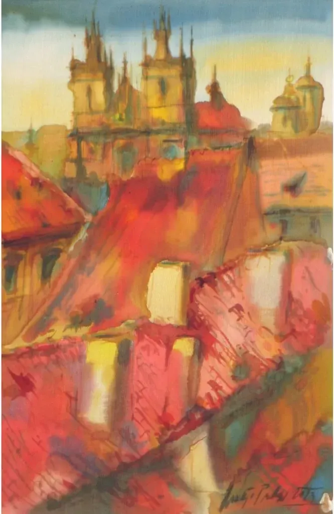 Ondrej ProkopCzech RepublicBatik on Silk20 X 31cm | 7.87 X 12.2in
£ 261 € 299 $352 Relevance
Score: 62%Matches: 2/2Post-Impressionism Style
Painterly surface and atmospheric color are paired with stronger stylization and structural simplification than classic Impressionism.
Tertiary Color
The palette includes many mixed intermediate hues such as terracotta, ochre, dusty coral, and muted teal-grey.
- A herd of sheep and being swallowed up...
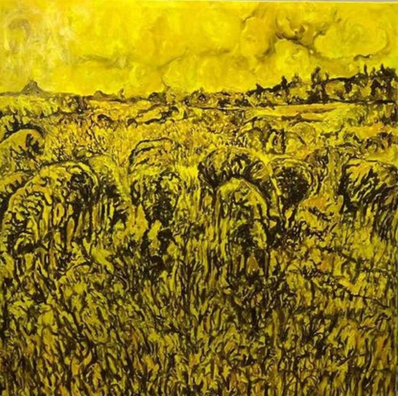 Fouad AgbariaIsraelOil on Canvas100 X 100cm | 39.37 X 39.37in
£ 7,548 € 8,650 $10,200 Relevance
Score: 62%Matches: 2/2Post-Impressionism Style
Painterly surface, strong stylization, and structured expressive color relate well to post-impressionist tendencies.
Tertiary Color
Much of the yellow shifts into ochre and brownish intermediate mixtures rather than staying purely primary.
- Music
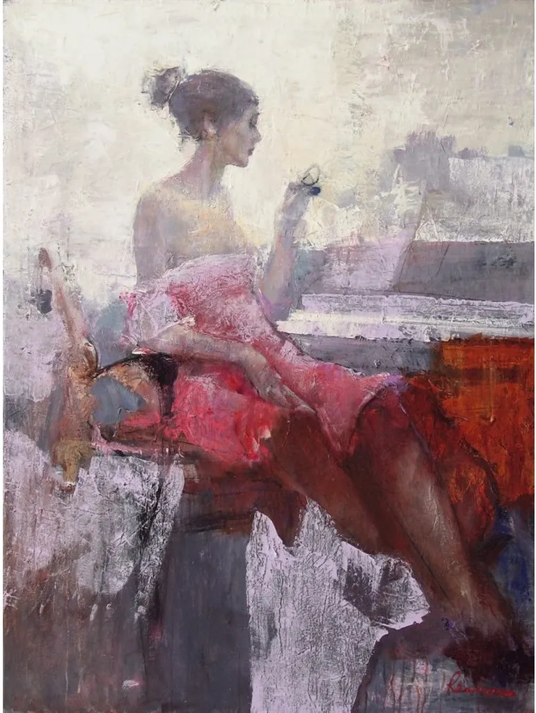 Serhiy ReznichenkoCzech RepublicOil on Canvas90 X 120cm | 35.43 X 47.24in
£ 6,378 € 7,309 $8,618 Relevance
Score: 62%Matches: 2/2Post-Impressionism Style
Painterly softness is combined with stronger stylization and compositional structure than pure Impressionism.
Tertiary Color
Many colors are mixed intermediate hues such as dusty mauves, taupes, and muted red-browns.
- Jerusalem Balcony
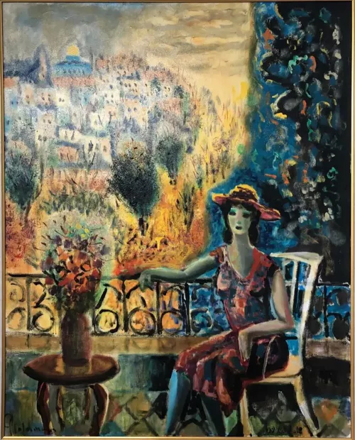 Albert GoldmanIsraelOil on Canvas80 X 100cm | 31.5 X 39.37in
£ 1,747 € 2,002 $2,360 Relevance
Score: 61%Matches: 2/2Post-Impressionism Style
Painterly surface, decorative color, and structured stylization extend beyond impressionist atmosphere toward a more constructed expressive image.
Tertiary Color
Many hues are mixed and nuanced—olive, ochre, blue-green, dusty rose—rather than pure primaries.
Receive 10% on your first artwork
Once a month be the first to know about new trends, artworks and offers
